To Access theme builder
Go to Site settings -> Crow Canyon Branding (Classic Sites) -> Try New Theme Builder

The Theme Builder gives you a way to create your own theme for the site:
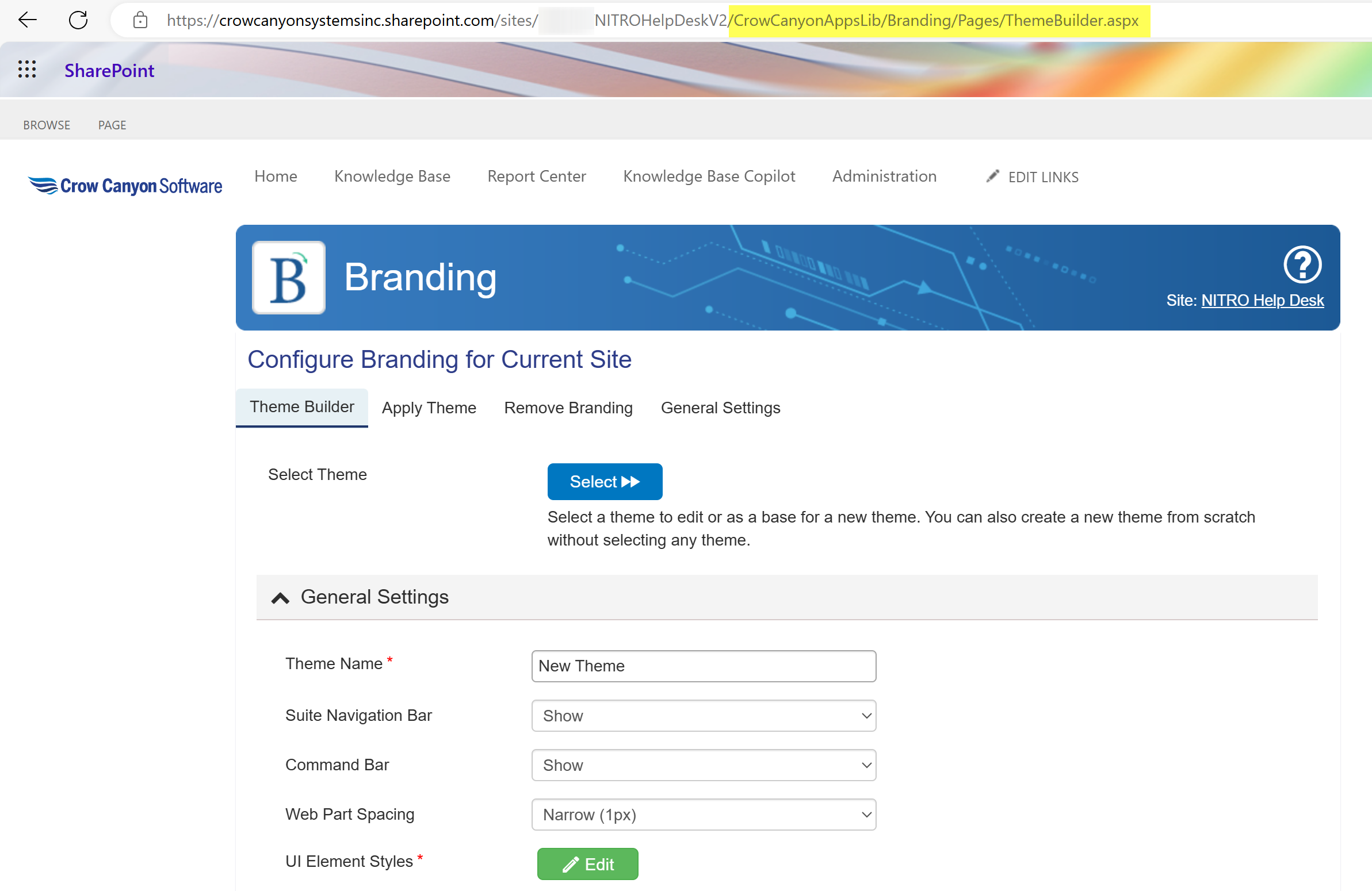
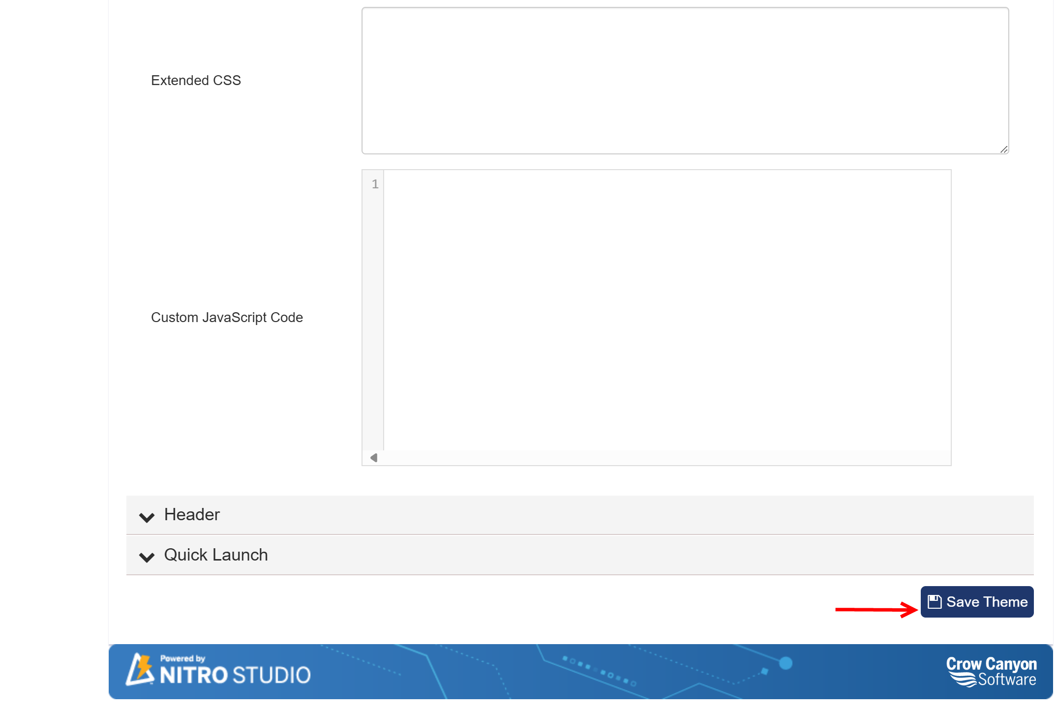
In Select Theme, Pressing "Select" allows you to modify a theme that is already loaded onto the site. Otherwise, you can directly add CSS and/or JavaScript in the General Settings section.
General Settings
Skip to Header settings
Skip to Quick Launch settings
Theme Name
Once you create your theme, its name will be displayed in the "Apply Theme" section, allowing you to easily identify and apply it.
Suite Navigation Bar
The Suite Navigation Bar runs along the top of your SharePoint site. You can choose to show or hide it by default.
•Expand: This option will keep the bar expanded by default, while still allowing users to collapse it if desired.
•Collapse: This option will keep the bar collapsed by default, but users can expand it when needed.

Command Bar
The Command Bar offers settings similar to those of the Suite Navigation Bar. You can decide whether to show or hide it by default.
•Expand: By selecting this option, the Command Bar will be expanded by default but will also remain collapsible.
•Collapse: This option keeps the Command Bar collapsed by default, allowing users to expand it when required.

Web Part Spacing
This setting automatically determines the spacing between web parts on your pages. The available options are:
•Narrow (1px)
•Medium (5px)
•Default (as defined by SharePoint)
UI Element Styles
This feature opens a screen where you can directly edit the styles of various elements defined in the site's CSS (Cascading Style Sheet). This allows for more granular customization of your site's appearance.
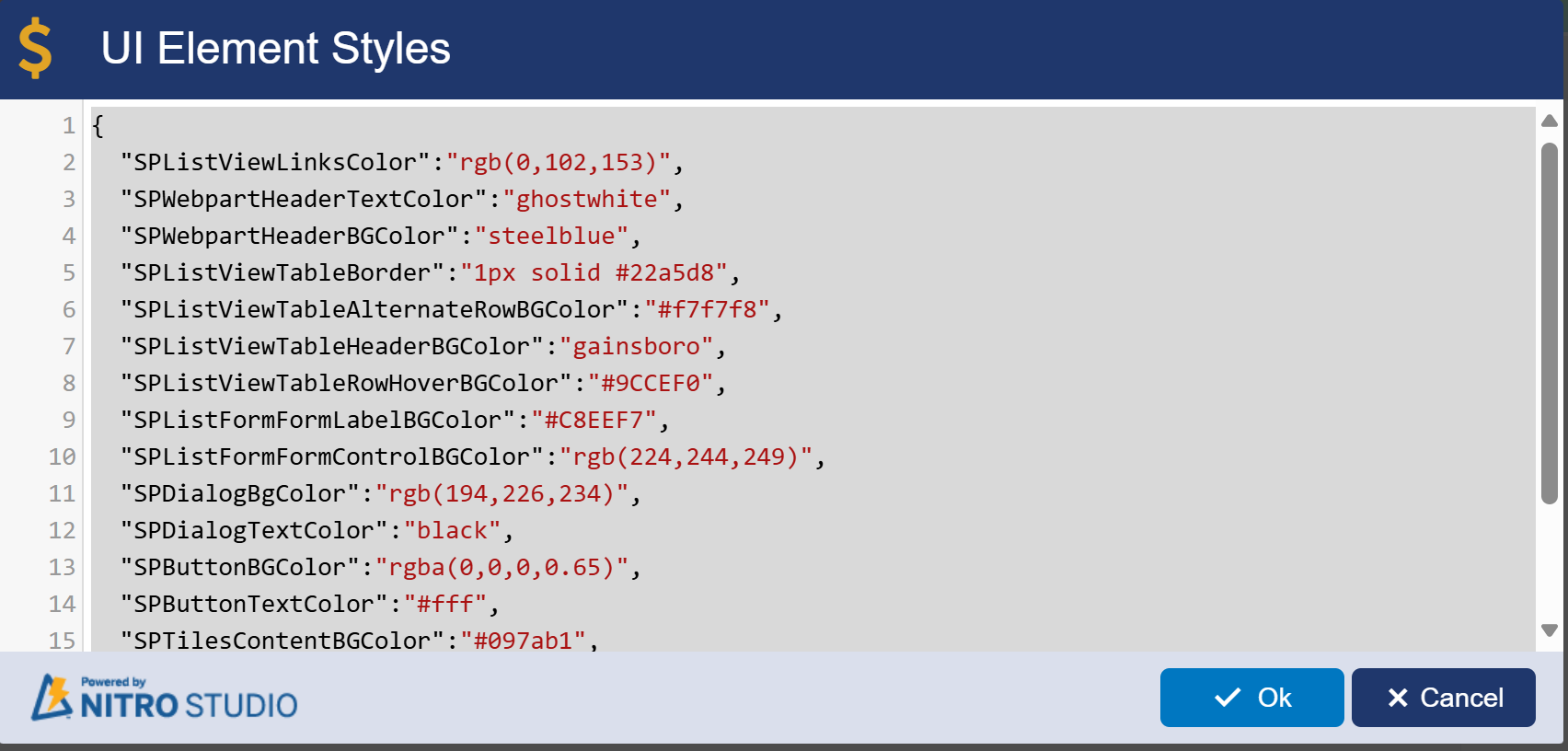
Extended CSS
The Extended CSS feature in the Theme Builder allows you to add custom CSS (Cascading Style Sheets) rules to your SharePoint site. This enables you to override or enhance the default styling of various elements within your site, providing greater control over its appearance. Extended CSS allows you to add custom styles to your SharePoint site to enhance its appearance. For example, if you want to change the background color of all buttons to blue, you could add the following CSS code:
button {
background-color: blue;
color: white;
}
Custom JavaScript Code
The Custom JavaScript Code feature allows you to incorporate JavaScript into your SharePoint site, enhancing its functionality and interactivity. For instance, if you want to display an alert when a button is clicked, you could use the following JavaScript:
document.getElementById("myButton").onclick = function() {
alert("Button clicked!");
};
Using Extended CSS, you can customize styles like colors and fonts, while Custom JavaScript Code allows you to add dynamic functionality, such as responding to user actions. Both features enhance the overall user experience on your SharePoint site.
Header Settings
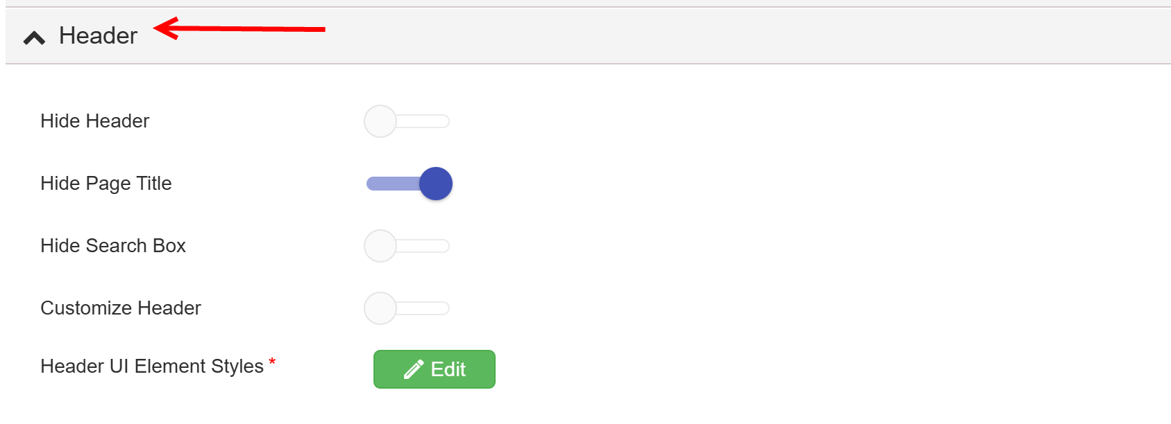
The header is located at the top of the page.

You have the option to completely hide the header, or selectively hide the page title and/or the search bar.
Additionally, you can customize the header using HTML and modify the links in the Top Link Bar as needed.
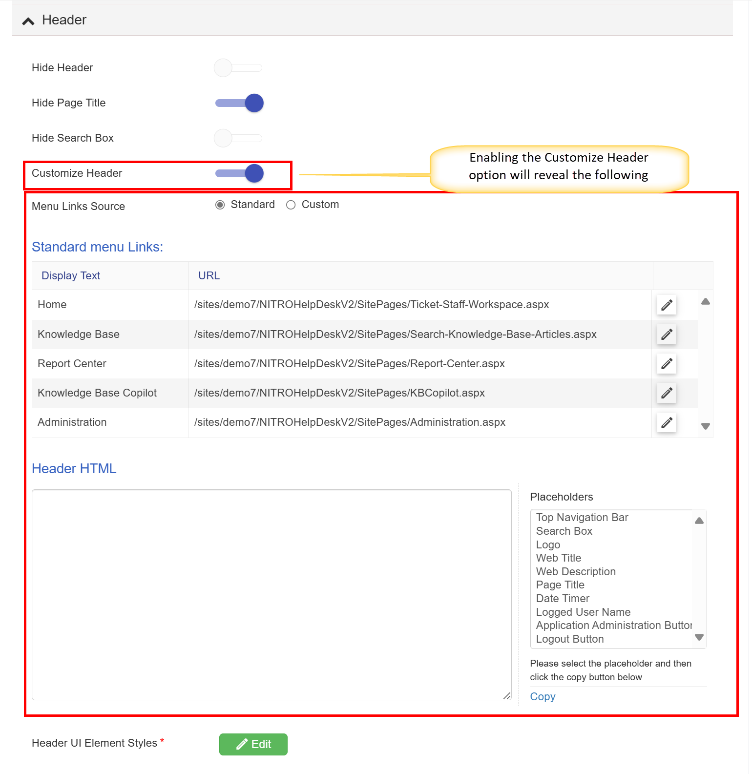
When the Menu Links Source setting is configured to Standard, it retrieves information from the Top Link Bar settings located under Site Settings (the standard SharePoint configuration). However, you also have the option to customize your links as needed.

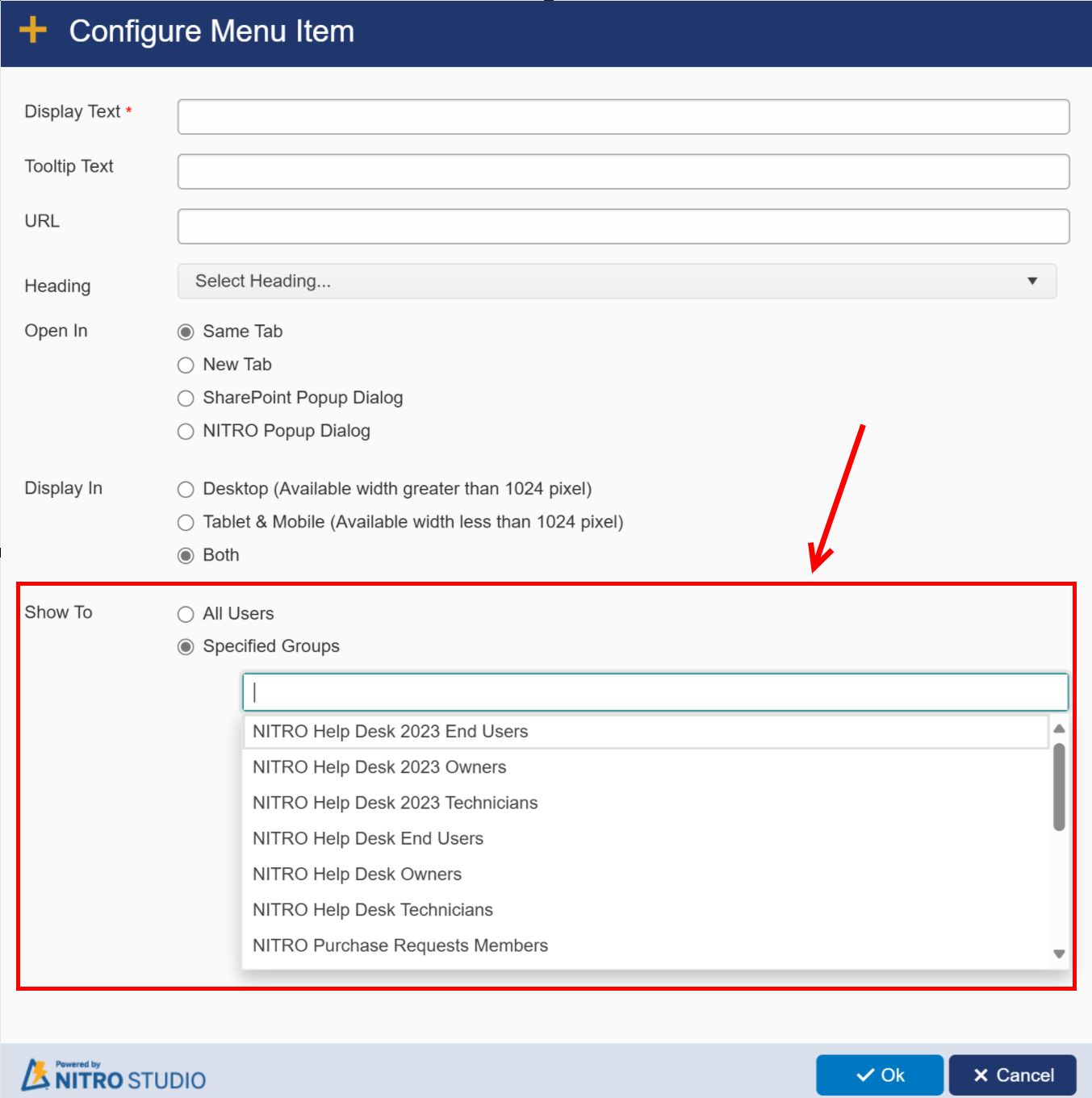
When you click on New Menu Item, you can create a new link, similar to how you would in SharePoint. The significant advantage here is that you can apply security trimming to these links, allowing you to control their visibility based on specific SharePoint groups. This means you can ensure that only designated users or groups have access to certain links, enhancing security and streamlining the user experience.
Display In
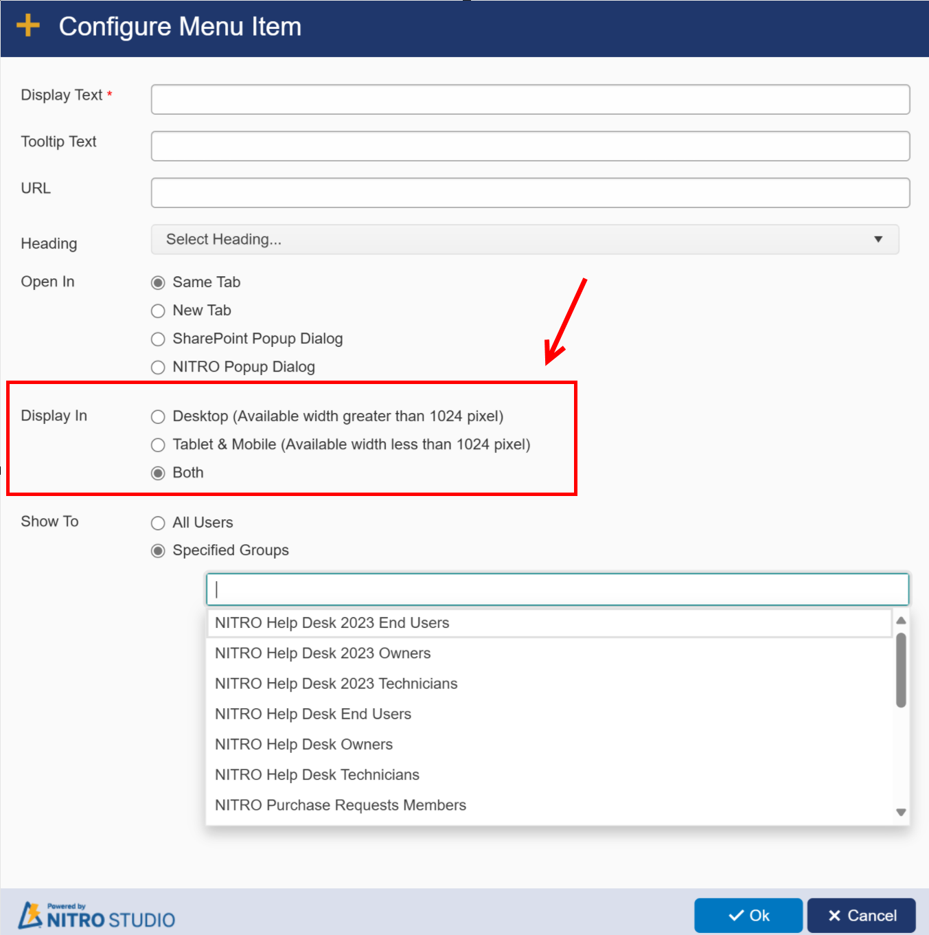
The Display In setting allows you to specify where your content or menu links should be visible based on the type of device being used to access the SharePoint site. The options include:
•Desktop (Available width greater than 1024 pixels): This option ensures that the content will only be displayed on devices with a screen width greater than 1024 pixels, typically desktops and larger laptops. This is ideal for elements that require more screen real estate or a more complex layout, allowing for a better user experience on larger displays.
•Tablet & Mobile (Available width less than 1024 pixels): Choosing this option means the content will be visible on devices with a screen width less than 1024 pixels, which generally includes tablets and smartphones. This setting is useful for optimizing the user interface for smaller screens, ensuring that users can still access important links and information without the clutter of unnecessary elements.
•Both: Selecting this option allows the content to be displayed on all devices, regardless of screen size. This is a flexible choice that ensures maximum accessibility and convenience for users, allowing them to access the same links and information whether they're on a desktop, tablet, or mobile device.
Customizing the Header Using the Header HTML Section
The Header HTML section in Crow Canyon software provides extensive customization options for the header of your SharePoint site. By utilizing this feature, you can modify the appearance and functionality of the header to better suit your organization's needs.
Key Customization Features
1.Full Customization:
oThe Header HTML section allows you to tailor the header completely. This means you can add or remove elements, change layouts, and implement custom styles that align with your branding guidelines or user interface preferences.
2.Hiding the Suite Bar:
oIf you decide to hide the Suite Bar, which typically displays essential information such as the logged-in user's name, you can still maintain a personalized experience.
oBy inserting HTML code into the header, you can dynamically display the user's name, ensuring that even without the Suite Bar, users still feel connected and recognized within the application. For example, you might use a placeholder that retrieves the logged-in user's name and displays it prominently in the header.
3.Example of Inserting User's Name:
oYou can use a specific HTML snippet or a placeholder like [[Logged User Name||Logged User Name]] to insert the user's name directly into the header. This enhances personalization, making the interface more user-friendly and tailored to individual users.
4.Editing Header Element Styles:
oBy clicking on the edit button next to "Header UI Element Styles," you can access and modify the CSS styles applied to various header elements. This feature enables you to:
▪Change colors, fonts, and sizes to create a cohesive look that matches your organization’s branding.
▪Adjust padding, margins, and layout properties to improve spacing and alignment, ensuring the header is aesthetically pleasing and functional.
5.Example of Style Customization:
oFor instance, if you want to change the background color of the header to align with your brand's color scheme, you can add CSS like:
.ccs_HeaderArea {
background-color: #004080; /* Dark blue header */
color: white; /* Text color */
}
6.Enhanced User Experience:
oCustomizing the header can significantly improve the user experience. A well-designed header not only provides essential navigation and information but also contributes to the overall branding of the application. It helps users navigate the site more efficiently and enhances their engagement with the content.
Quick Launch Settings

Quick Launch
The Quick Launch feature in the Theme Builder of Crow Canyon software provides users with the ability to manage and customize the left-hand navigation panel of a SharePoint site. This panel is essential for user navigation, offering quick access to important links and functionalities. Below is a detailed explanation of each component related to Quick Launch in the Theme Builder.
1. Hide Quick Launch
•Description: This option allows you to completely hide the Quick Launch panel from the site pages. When selected, users will not see the Quick Launch menu, which can help declutter the interface if you want to encourage navigation through other means, such as a custom header or a different navigation structure.
2. Quick Launch Type
•Options: The Quick Launch can be displayed in three different types, each offering a unique layout and functionality:
oDefault: This is the standard layout provided by SharePoint, featuring a simple list of links that expand and collapse. It is straightforward and familiar to most users.
oAccordion: This type presents the links in an accordion-style menu. When a user clicks on a top-level link, it expands to show sub-links, allowing for a cleaner interface that saves space. This format is particularly useful for sites with many links, as it minimizes the visible options and helps users focus on the task at hand.
oModern: The modern Quick Launch type utilizes a more contemporary design approach, aligning with the current SharePoint user experience. It offers a visually appealing layout and may include features like icons next to links, enhancing the overall navigation experience.
To learn more about these settings and what they look like, refer to the Quick Launch Styles section under Crow Canyon Themes.
•Quick Launch Configuration Button: This button appears when you select the Modern Quick Launch type. It provides access to settings specifically for customizing the display of links within the Modern Quick Launch format, allowing you to tailor the navigation experience according to your preferences.
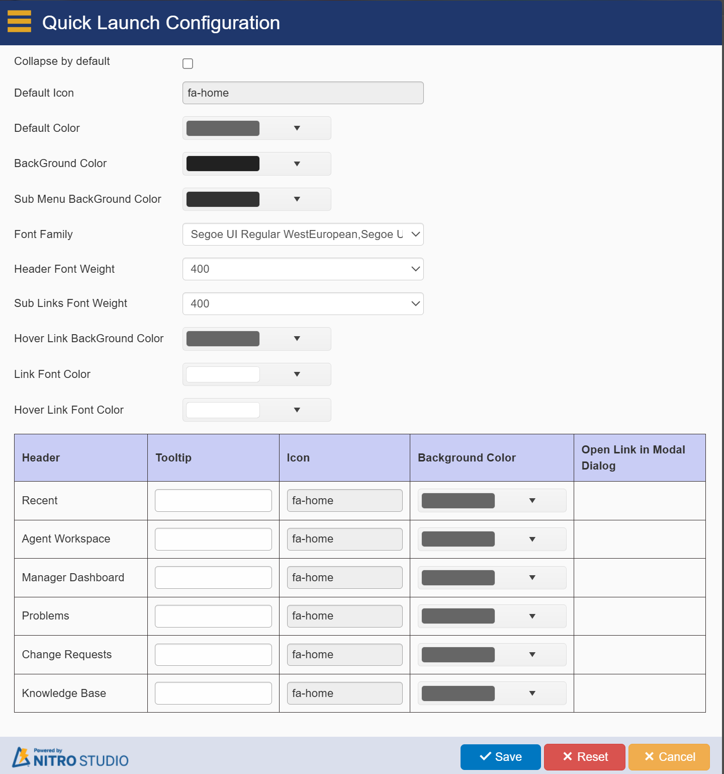
Explanation of each heading in the Quick Launch Configuration:
1.Collapse by default: Determines whether the Quick Launch menu will be collapsed when the page loads.
2.Default Icon: Sets a default icon (like fa-home) for menu items that don’t have a specified icon.
3.Default Color: The color applied to the Quick Launch by default unless otherwise specified.
4.BackGround Color: The background color behind the top-level Quick Launch links.
5.Sub Menu BackGround Color: The background color for second-level (sub-menu) Quick Launch links.
6.Font Family: Defines the font used for Quick Launch text (e.g., Segoe UI Regular, Tahoma, Arial).
7.Header Font Weight: Determines the thickness (weight) of the font used for header items (e.g., 400 for normal weight).
8.Sub Links Font Weight: Font weight for sub-menu links under the main headers.
9.Hover Link BackGround Color: The color that appears when the user hovers over a link.
10.Link Font Color: The color used for the text in the Quick Launch links.
11.Hover Link Font Color: The color that appears for the text when hovering over a link.
12.Header: A section to configure the main headers in the Quick Launch, including their tooltip, icon, background color, and option to open links in a modal dialog.
13.Recent: Configures the Recent link’s icon (e.g., fa-home), part of the Quick Launch.
14.Agent Workspace: Configures the Agent Workspace link’s icon and style.
15.Manager Dashboard: Configures the Manager Dashboard link’s icon and style.
16.Problems: Quick Launch link with fa-home as its icon.
17.Change Requests: Displays with the fa-home icon in the Quick Launch.
18.Knowledge Base: Uses the fa-home icon for its Quick Launch link.
Each section allows for detailed customization of the appearance and behavior of links in the Quick Launch menu.
3. Quick Launch Links Source
•Options: This setting determines the source of the links displayed in the Quick Launch panel:
oStandard: When this option is selected, the Quick Launch will pull its links directly from the Top Link Bar settings under the Site Settings. This is useful for sites that want to maintain consistency with SharePoint's built-in navigation.
oCustom: Choosing this option allows for greater flexibility, as it enables you to create and manage custom links specific to your organization's needs. You can manually add, edit, or remove links, providing a tailored navigation experience.
4. Quick Launch UI Element Styles
•Edit: This feature allows you to customize the appearance of the Quick Launch links and their surrounding elements. By clicking the edit button, you can adjust the styles using CSS, including:
oBackground Color: Change the color of the background for the Quick Launch panel, which can help it stand out or blend in with the overall site design.
oText Color: Modify the color of the link text for better visibility or to match branding.
oFont Styles: Adjust the font size, style, and weight to ensure the text is readable and fits the desired aesthetic.
oHover Effects: Implement styles that change when users hover over links, such as changing the background color or text color, enhancing user interaction and engagement.
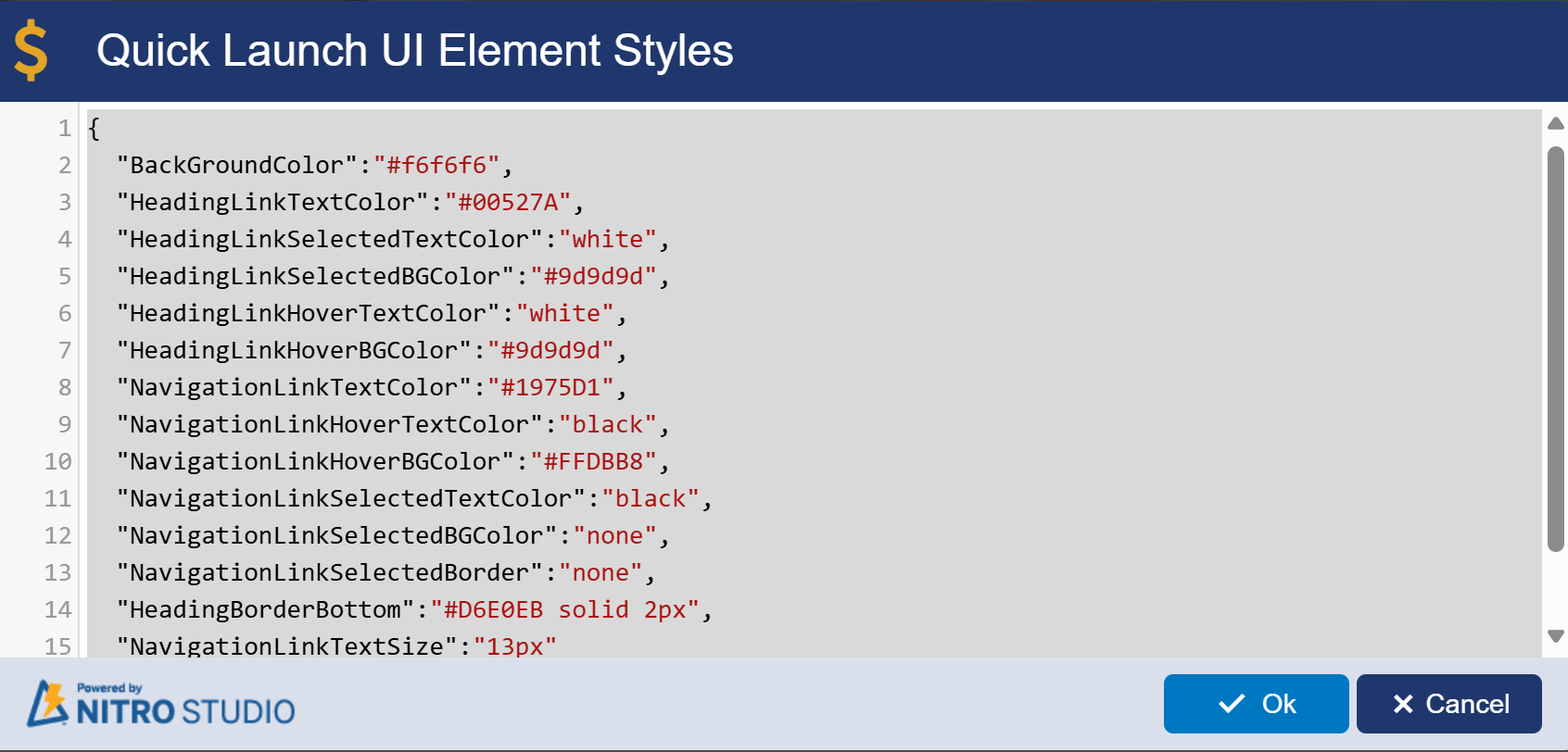
Quick Launch UI Element Styles: You can also directly edit the colors of the Quick Launch by clicking on the Edit button next to Quick Launch UI Element Styles:
Custom Quick Launch:

1.Quick Launch Links Source:
oStandard: Uses the default Quick Launch links from the SharePoint site settings.
oCustom: Allows you to define your own Quick Launch links rather than using the default ones.
2.Custom Quick Launch Links
oDisplay Text column: Specifies the visible text for each Quick Launch link.
oURL column: The target URL where each link directs users.
New Quick Launch Link Button
oThis button allows you to add new links to the Quick Launch. You can specify both the display text and the target URL for each new link.
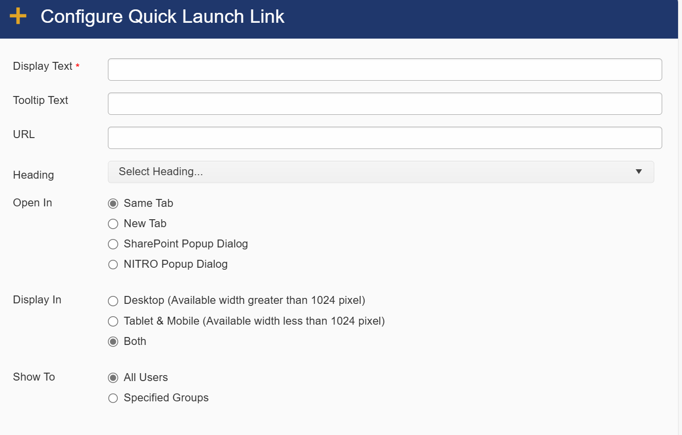 |
Configure Quick Launch Link provides options to customize how a specific Quick Launch link behaves. Here’s an explanation of each setting:
1.Display Text*
oThis is the required field where you enter the name or label of the link as it will appear in the Quick Launch menu.
2.Tooltip Text
oOptional text that appears when a user hovers over the link, providing additional context or a description of what the link does.
3.URL
oThe web address or SharePoint path where the link will direct users when clicked.
4.Heading
oYou can organize your links under headings or categories to group related links for better navigation.
5.Open In
oSame Tab: Opens the link in the current browser tab.
oNew Tab: Opens the link in a new browser tab.
oSharePoint Popup Dialog: Opens the link in a standard SharePoint pop-up window.
oNITRO Popup Dialog: Opens the link in a customized NITRO Forms pop-up window for a tailored user experience.
6.Display In
oDesktop: Shows the link only when the screen width is greater than 1024 pixels (standard desktop view).
oTablet & Mobile: Displays the link when the screen width is less than 1024 pixels (for mobile and tablet devices).
oBoth: The link will be visible across all devices, regardless of screen size.
7.Show To
oAll Users: The link will be visible to everyone who has access to the site.
oSpecified Groups: Allows you to restrict the visibility of the link to certain SharePoint groups, enabling security trimming of navigation links based on user roles.
3.Quick Launch Menu: Export/ Import
oProvides the option to export the Quick Launch configuration for reuse or import it into another site for consistent navigation across sites.
4.Quick Launch UI Element Styles
oEdit: Opens the option to customize the visual styles (CSS) of the Quick Launch, such as fonts, colors, and layout.
This system allows for flexible navigation management, whether you rely on standard SharePoint settings or prefer to tailor the menu to your specific needs.
Custom Themes: for this please refer Configuring Custom Themes
Remove Branding: for this please refer Removing Branding
General Settings: for this please refer General Settings