Configuring List Rollup Definitions
All list rollups configured in a Site will be shown under ‘Manage List Rollup Definitions’ tab. Here we can Create, Edit, Copy and Delete list rollups.
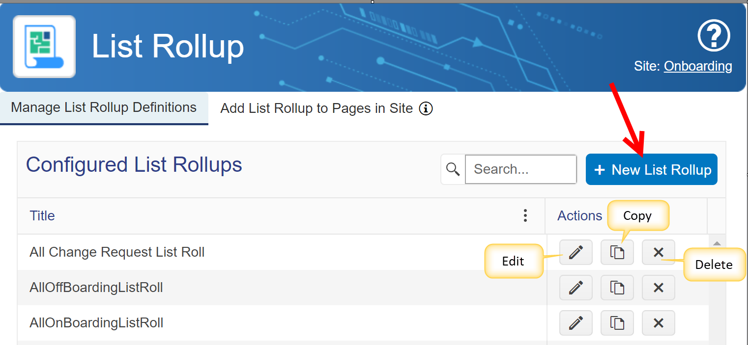
New List Rollup
1.Click on ‘New List Rollup’ button
2.Configuration settings
a.General Settings:
In General settings, we need to specify Title for List Rollup definition and whether to allow creation of list items directly from list rollup web part as shown below
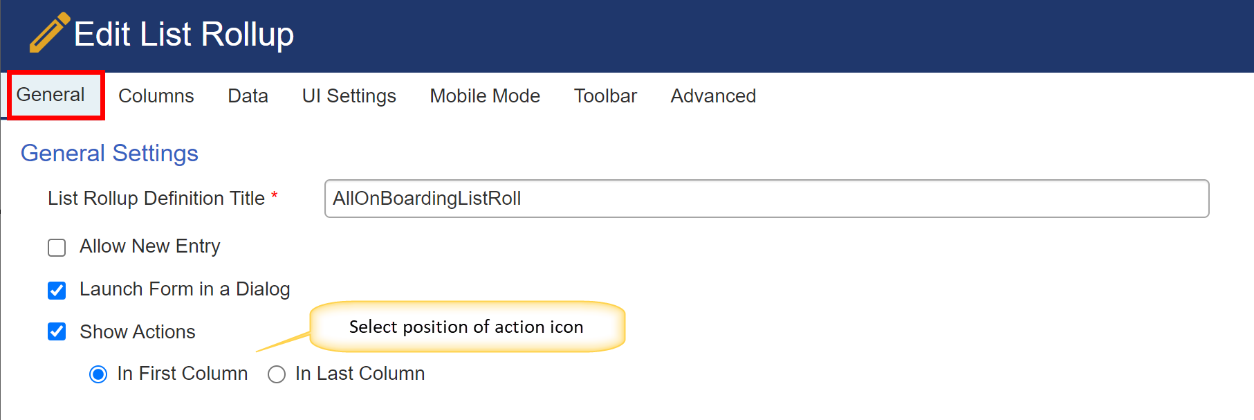
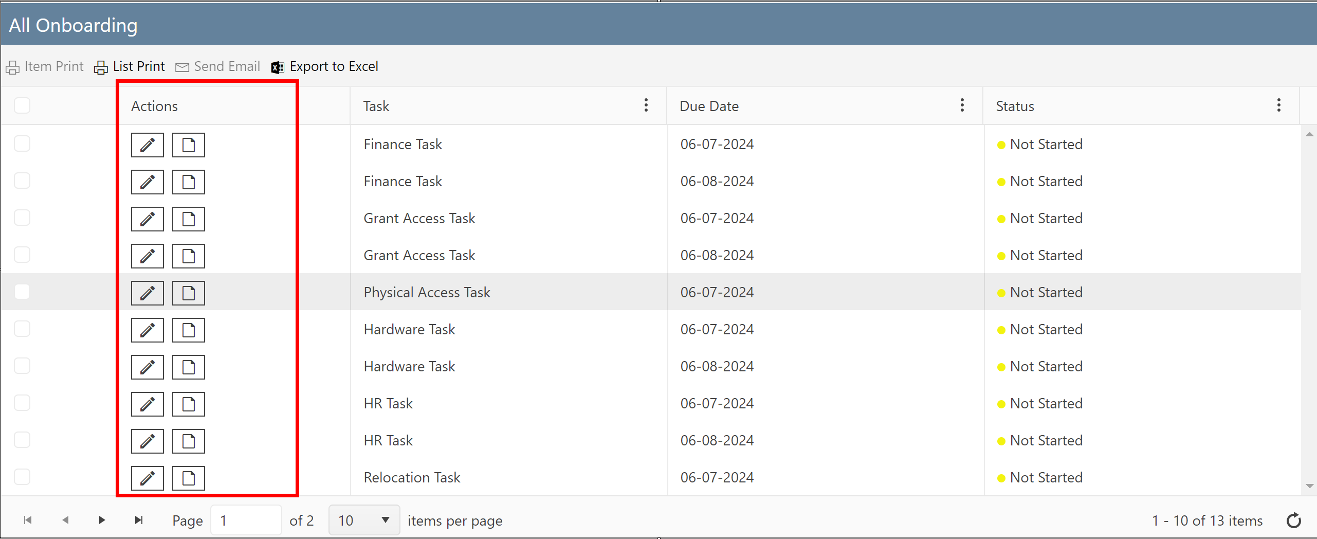
Example with Actions in First Column:
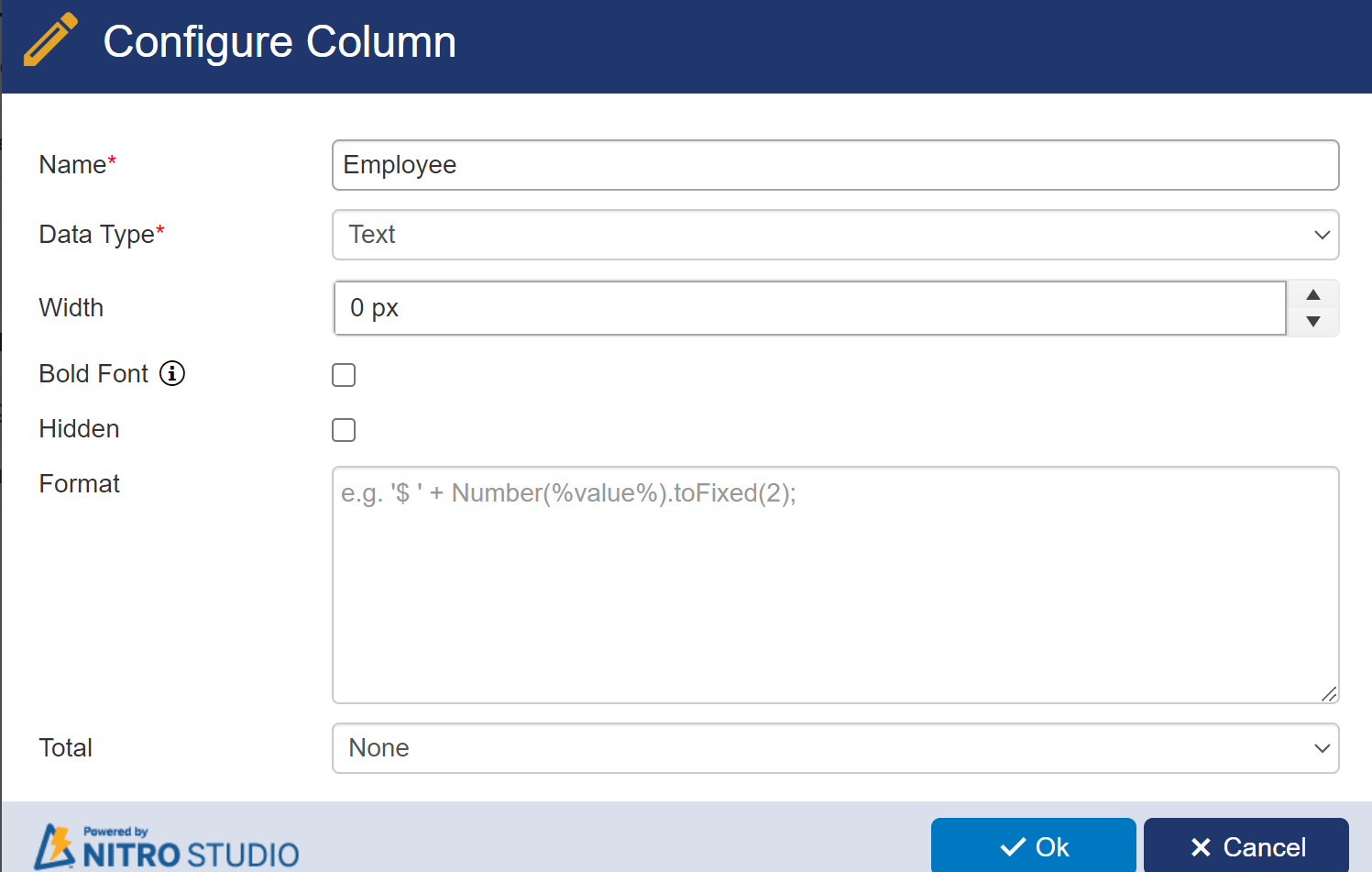
b.Columns tab: Define columns for this rolled-up list in 'Columns' tab:
Here we need to create columns to show in List Rollup web part which are later mapped with SharePoint columns from Rolled-up lists.
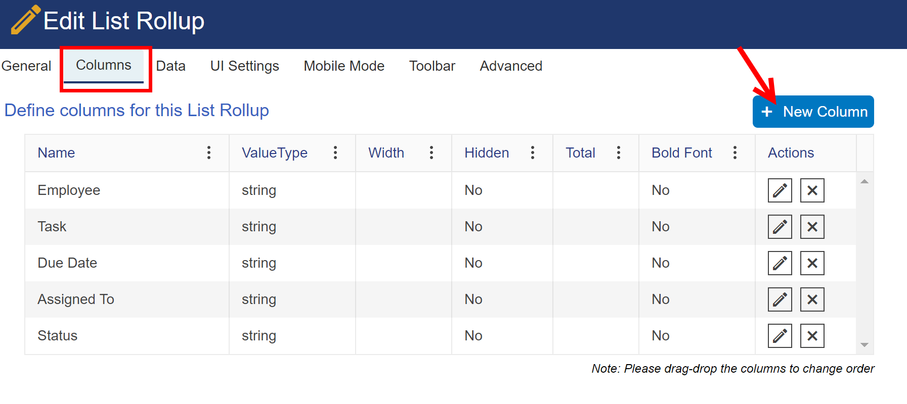
Click on ‘New Column’ button to create columns for list rollup web part
c.Data Tab: Configure lists for this rollup in 'Data' tab
•Click on ‘Add List’ button to configure lists to rollup
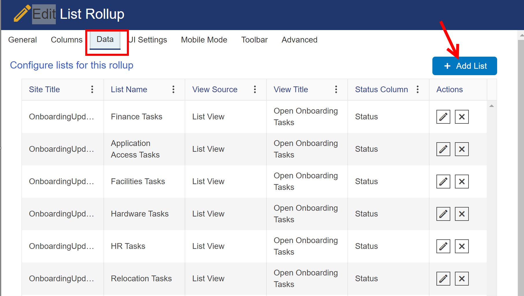
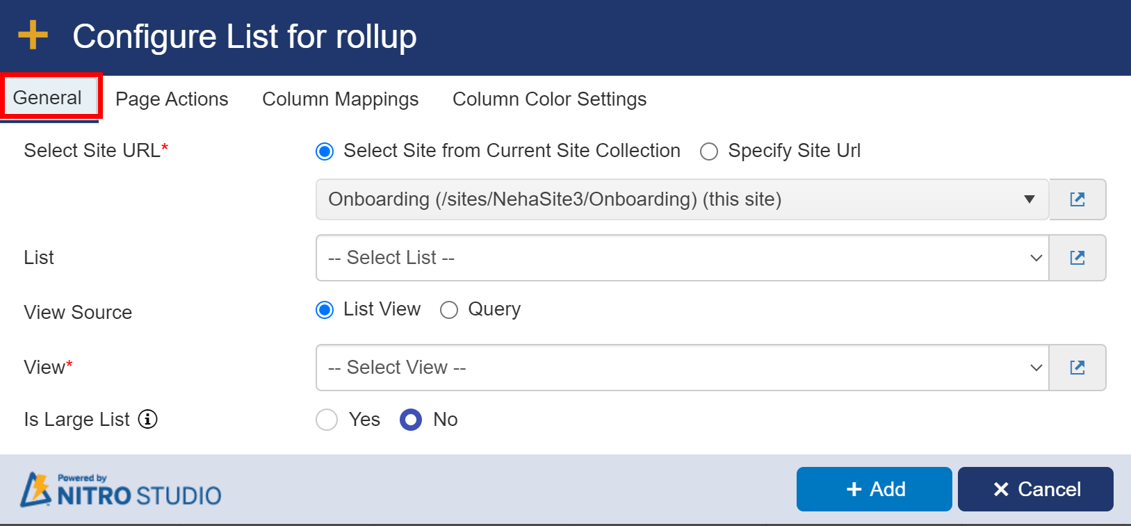
below window will open after clicking 'Add List' button.
Add List Settings:
General Tab: Select Site, List, View Source and View from which data should be retrieved to show in List rollup.
| Is Large List: Use this option if list has large number of items and list view doesn't work due to threshold error. |
Page Actions Tab :
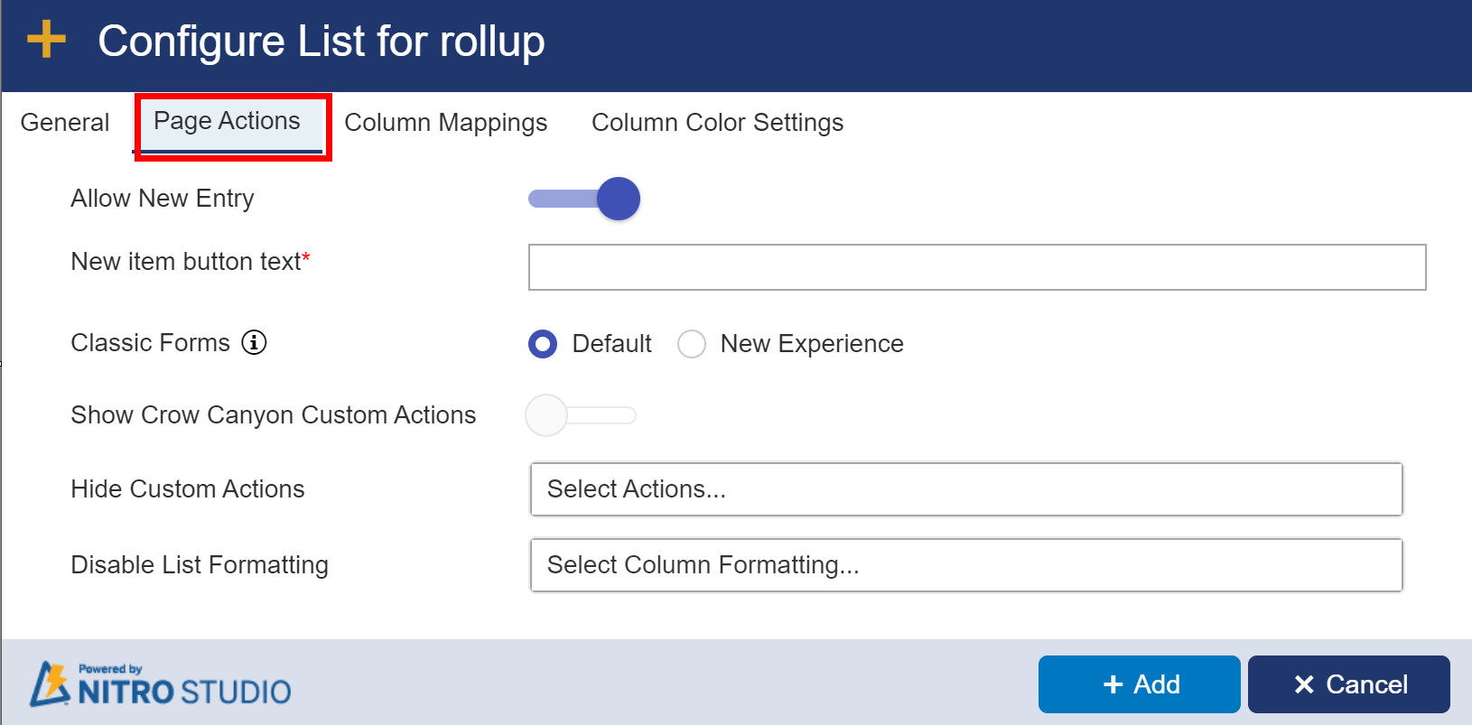
Allow New Entry: Allows you to toggle the ability to add new items to the list on and off
New item button text: provide custom text for new button
Classic Forms: The "New Experience" will show the modern responsive tool bar when viewing a list item. "Default" will show the Classic UI ribbon.
Show Crow Canyon Custom Actions: If there are any Custom Actions configured for the list, they can appear in the ribbon with this option turned on. When this is enabled, the "Hide Custom Actions" box will appear. You can also choose to hide one or more Custom Actions from the list view.

Disable List (Conditional) Formatting: You can choose one or more List (Conditional) Formatting settings to be disabled for this list view.
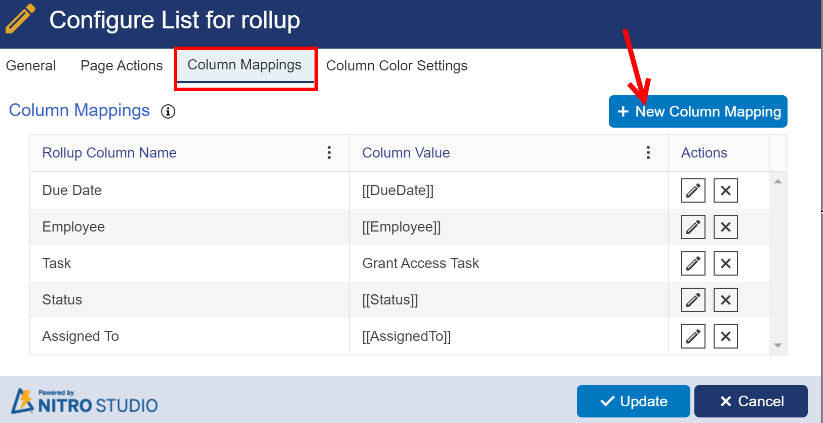
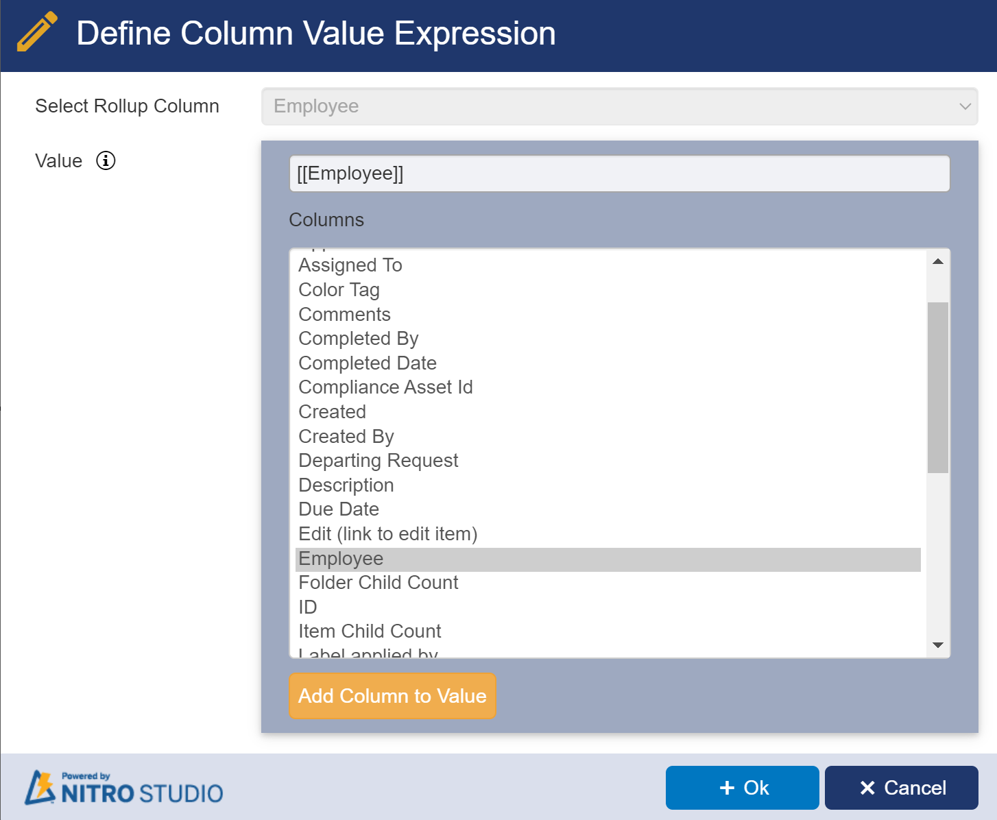
Column Mappings Tab: Click on ‘New Column Mapping’ button to map list rollup columns created in step 2(b)
Column Color Settings
Configure Color settings on columns in the list rollup by specifying conditions based on which color gets displayed in list rollup web part. Click on ‘New Color Setting’ button to create a new setting.
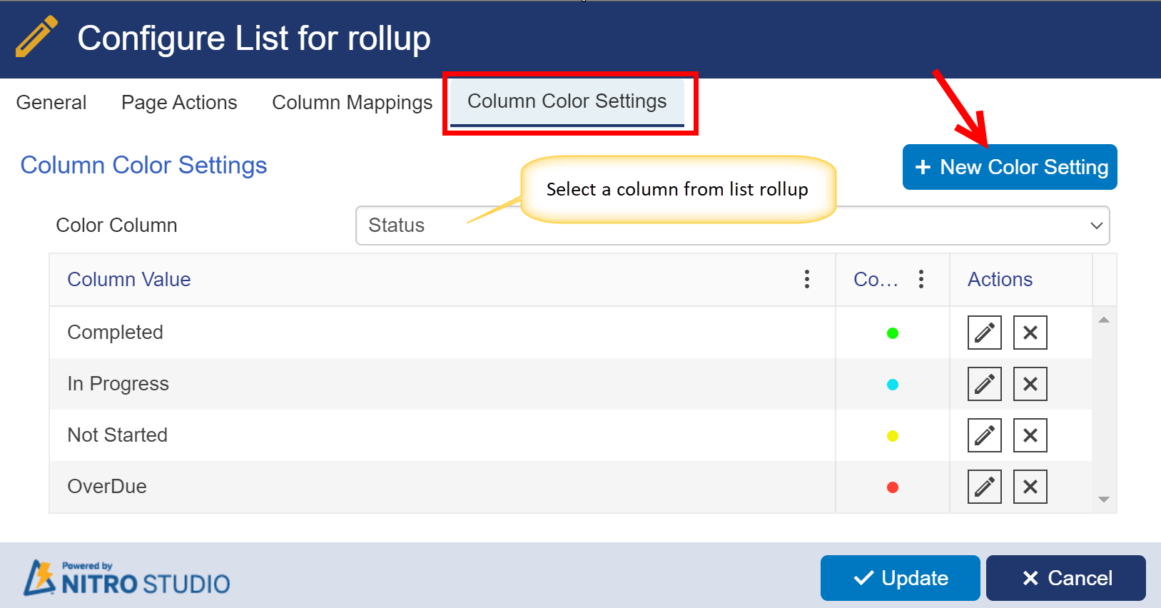
Example: ‘Status’ column in list rollup web part will be shown as shown below based on the specified values in color settings

Note: Similarly configure any number of lists in this rollup to show as a web part in a dashboard or web part page
d. UI Settings Tab:
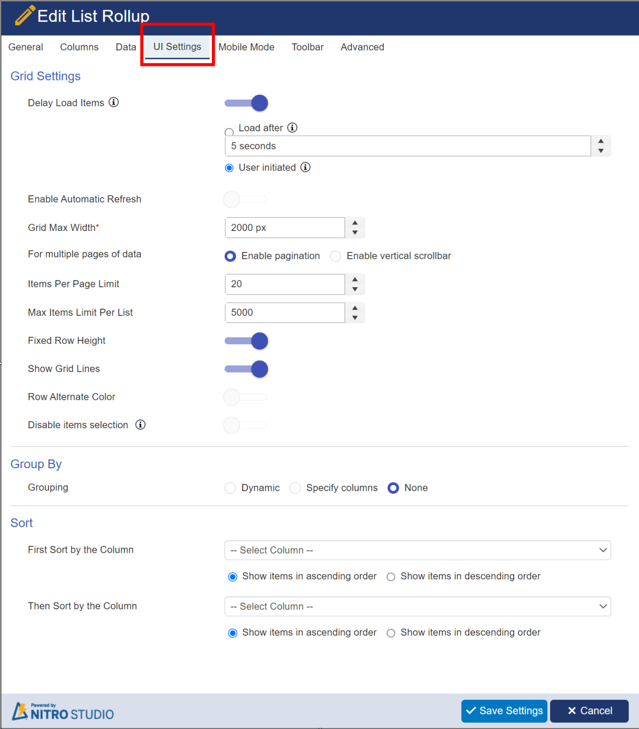
Grid Settings:
Delay load items: Allows for delaying the load of the web part to speed up the overall loading of the workspace page where this list rollup is added
Enable Automatic Refresh: Allows for the data to be refreshed periodically.
Grid Max Width: Max width of the list rollup on the web page. Default value is 1550px.
For multiple pages of data: it has two optons: 1) Enable pagination: this option allows to arrange the items into separate pages
2) Enable verticle scrollbar: It allows users to scroll items up and down within a fixed viewing area.
Items Per Page Limit: Determines how many items to show on a page before there is pagination.
Max Items Limit Per List: Total items allowed per list. Max is 5000 as per Microsoft standards.
Fixed Row Height: Sets the row height to be consistent.
Show Grid Lines: Shows lines in between the items when there are multiple items in the view.
Enable Row Filtering: Allows you to filter items quickly by the value in a given column.
Row Alternate Color: Alternates between white and light blue for list views with multiple items.
Disable items selection: hide checkboxes column to disallow selection of multiple items.
Group By:
Gives you various grouping options.
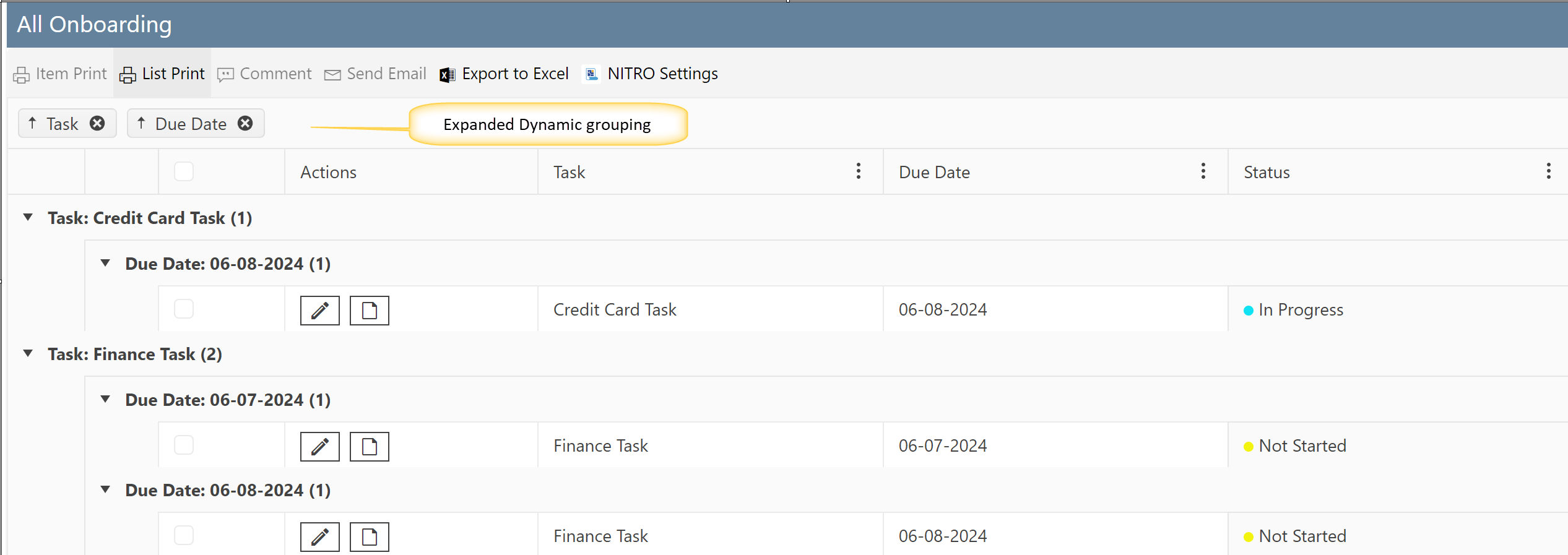
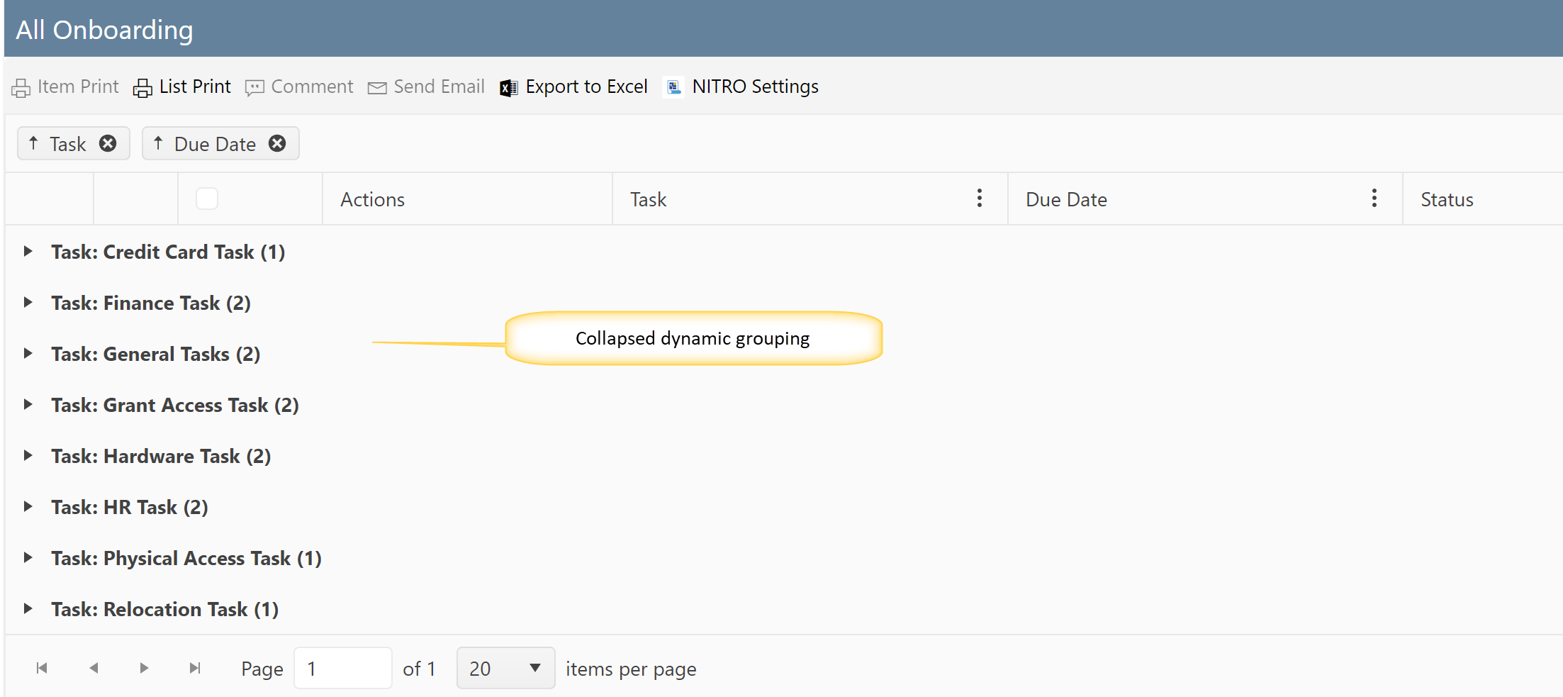
| Dynamic: Allows you to decide in real-time which column to group by on the display page for your List Rollup. Just select and |
| drag the column you wish to group by to the blue bar at the top of the List Rollup. It provides two options to select: |
| Collapsed and Expended. |
 |
| Example of Expanded Dynamic Grouping: |
 |
| Example of Collapsed Dynamic Grouping: |
 |
| Specify columns: Allows you to choose which column to group by. First group by the column and Then group by the column allow you to select multiple columns to group by and whether they are grouped in ascending or descending order. |
| It provides two options to show view: Collapsed and Expended. |
 |
| None: If you don't want to provide any grouping then select this option. |

Sort: this option provides sorting in ascending and decending order
e. Mobile Mode Tab:
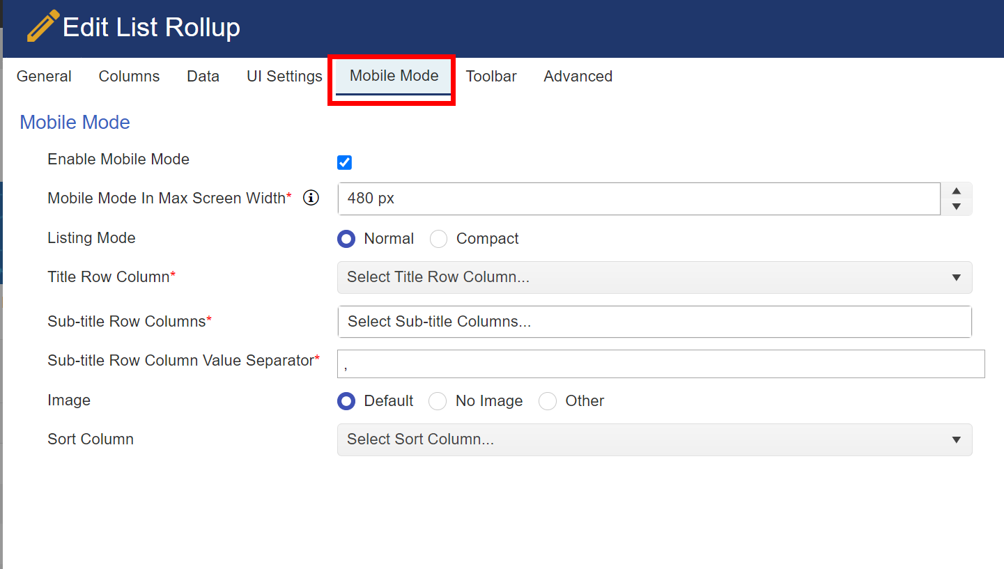
Refer Mobile Mode for more detail.
f. Toolbar Tab:
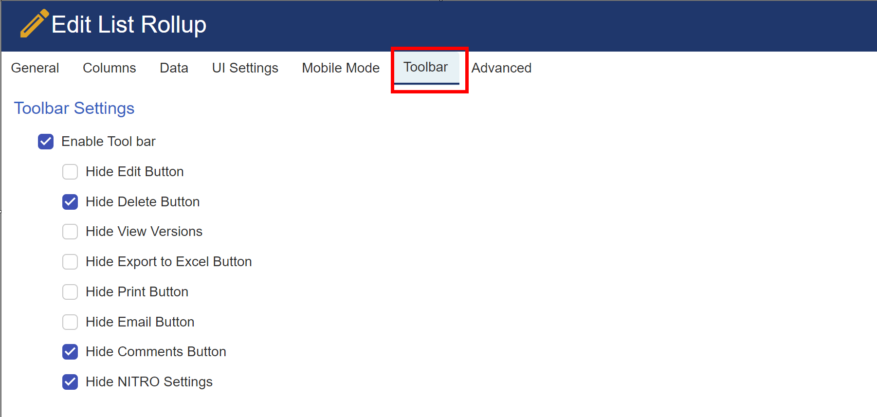
Hide Edit Button: Hides the item Edit button from the list rollup ribbon.
Hide Delete Button: Hides the delete button from the list rollup ribbon.
Hide View Versions Button: Hides the item view versions button from the list rollup ribbon.
Hide Export to Excel Button: Hides the button that allows the user to export the list rollup data to Excel.
Hide Print Button: Hides the Crow Canyon Print button from the list rollup ribbon.
Hide Email Button: Hides the Crow Canyon Email button from the list rollup ribbon.
Hide Comments Button: Hides the comments button from the list rollup ribbon.
Hide NITRO Settings Button: Hides the button that will take the user to the NITRO list view settings page of the list.
Example of toolbar:

| g. Advanced Settings Tab: |
 |
| Refer Advanced Settings section in This Topic |
| Refer Crow Canyon List View Advanced Settings for advanced settings |