For Managing Report Themes
Go to SharePoint site -> Settings -> Site contents -> Site settings -> Crow Canyon NITRO Apps -> NITRO Reports -> Themes
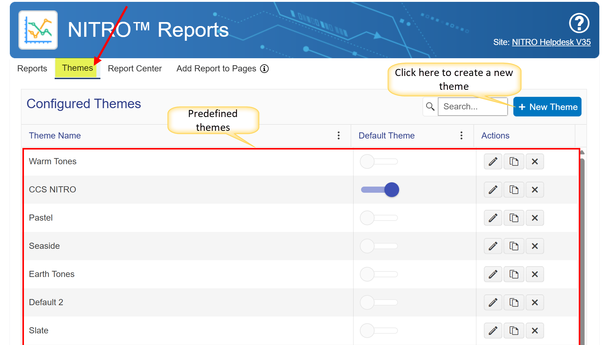
predefined themes have been introduced to enhance report visualization. These themes allow users to quickly change the appearance of reports with a single selection.
Example:
A user can select from various themes such as:
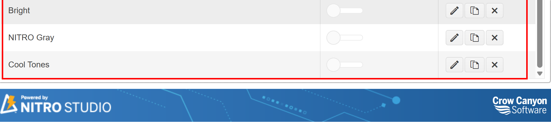
•Bright
•Cool Tones
•Warm Tones
•Slate
•Seaside
Each theme applies predefined styles to improve the report’s aesthetics and readability.
Steps to Apply a Theme:
1.Navigate to the Themes section in NITRO Reports.
2.Choose the desired theme from the list.
3.Click the toggle to set it as the Default Theme.
4.The selected theme will now apply to all relevant reports.
Click the ‘New’ button to create a new theme. The following window will appear, allowing you to configure the settings as per your requirements.
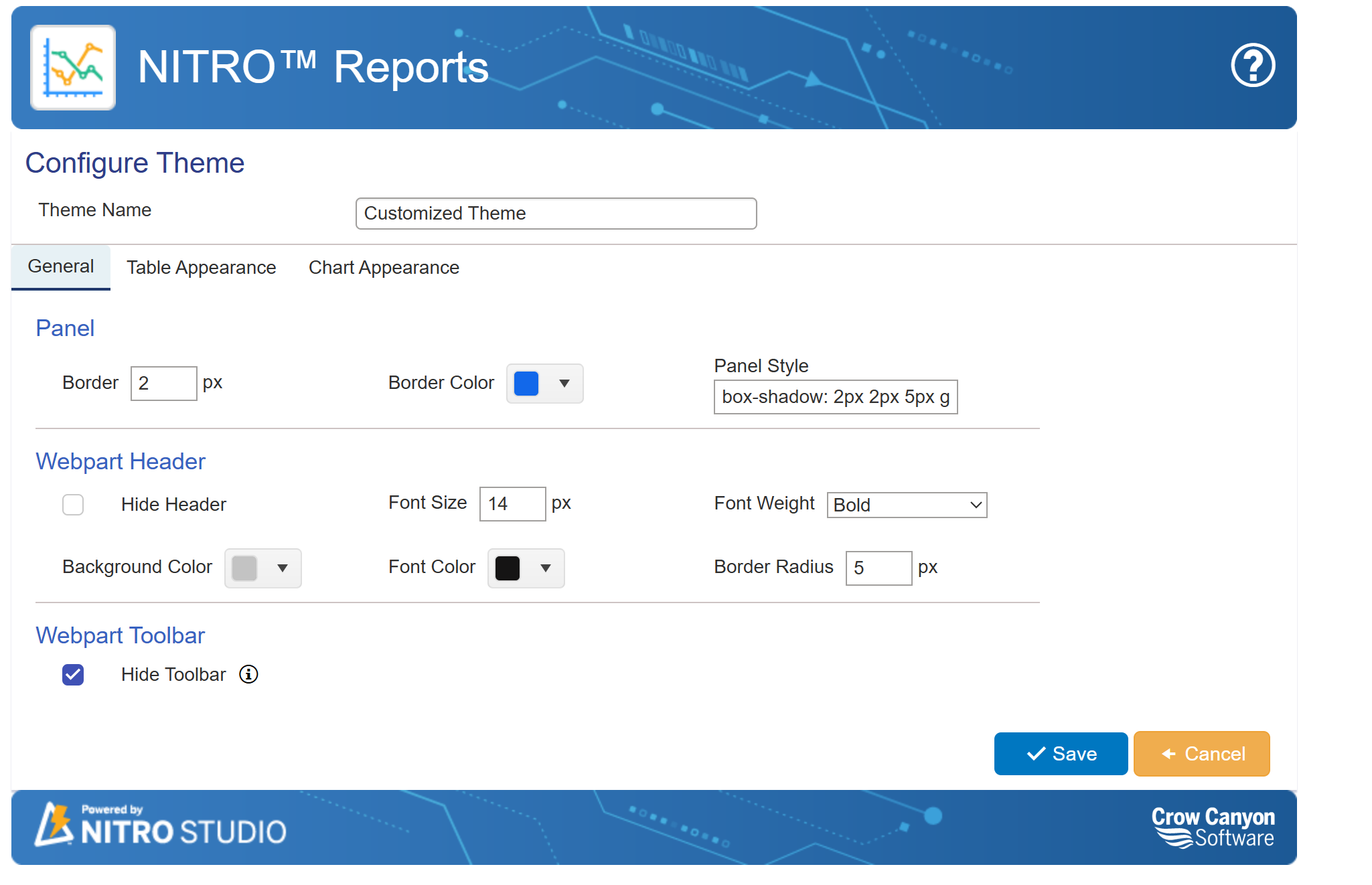
Theme General Settings for NITRO Reports
The General settings in the NITRO Reports Theme Configuration allow users to customize the appearance of reports, including the panel, web part header, and toolbar. These settings help users maintain consistency in design and enhance the visual appeal of reports.
Default Settings:
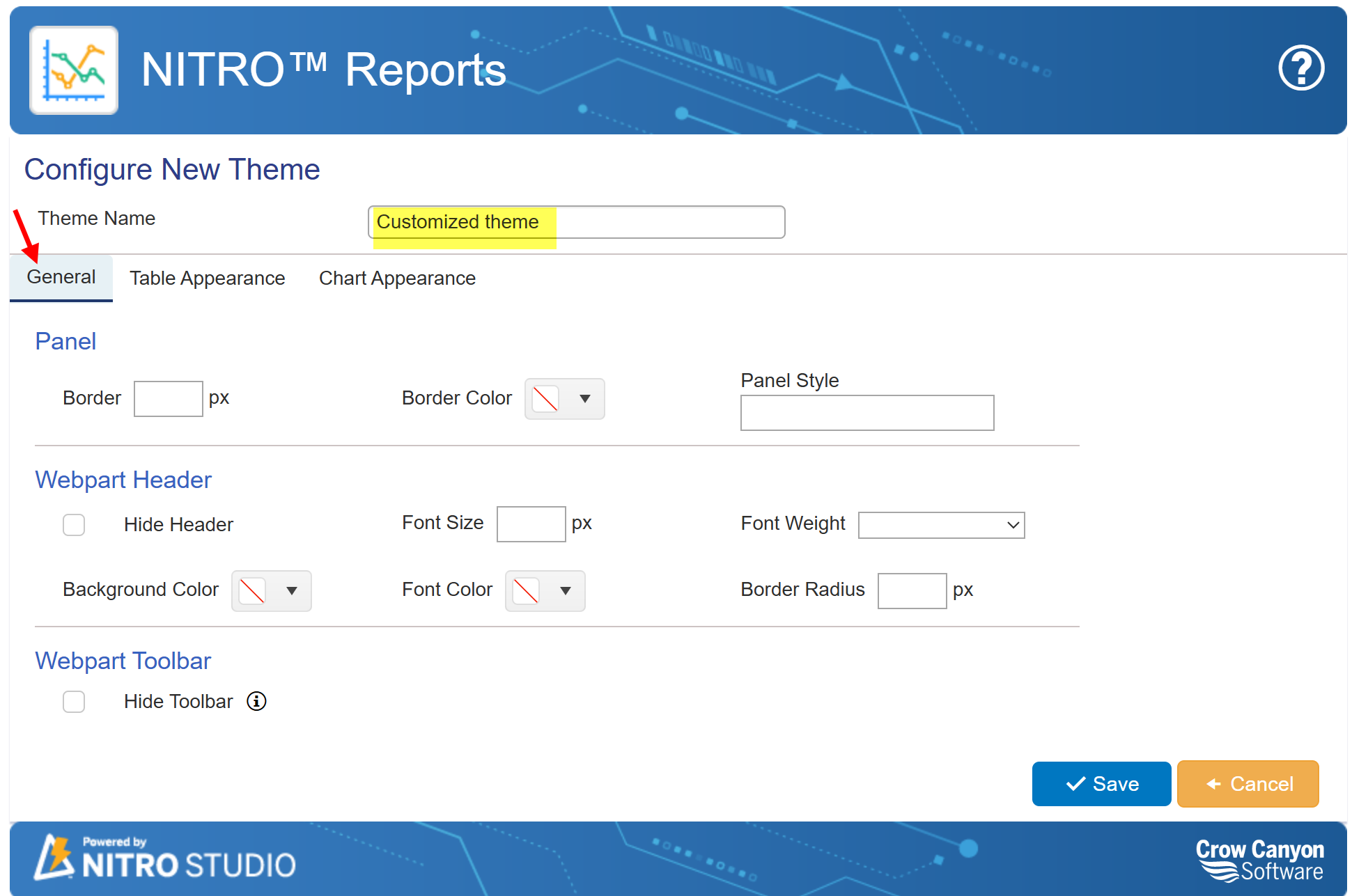
Theme Name: Defines the name of the customized theme. This name helps in distinguishing different themes applied to reports. Example: "Customized Theme"
Panel Settings: These settings control the appearance of the report's main container or panel.
a. Border: Defines the thickness of the panel’s border.Example:
oWith Value: 2 px (A visible border is applied).
oWithout Value: No border is displayed.
b. Border Color: Specifies the color of the panel’s border. Example:
oWith Value: Blue (The border will be blue).
oWithout Value: Default system color or no border.
c. Panel Style: Allows users to apply custom CSS styling to the panel.Example:
oWith Value: "box-shadow: 2px 2px 5px gray;" (Adds a shadow effect).
oWithout Value: No special style is applied.
Webpart Header: The web part header settings control the appearance of the title or top section of the report.
a. Hide Header: If checked, the report’s header is hidden.If unchecked, the header is visible.
b. Font Size: Controls the text size of the header. Example:
oWith Value: 14 px (Makes the text larger).
oWithout Value: Default font size is applied.
c. Font Weight: Defines the boldness of the header text. Example:
oWith Value: "Bold" (Makes the header text bold).
oWithout Value: Default font weight is used.
d. Background Color: Changes the background color of the header. Example:
oWith Value: "Light Gray" (A light gray background is applied).
oWithout Value: Default background color is used.
e. Font Color: Sets the color of the header text.Example:
oWith Value: "Black" (Text appears in black).
oWithout Value: Default font color is applied.
f. Border Radius: Defines the roundness of the header’s corners. Example:
oWith Value: 5 px (Rounded corners are applied).
oWithout Value: The header has sharp corners.
Webpart Toolbar: The toolbar settings determine the visibility of the report’s toolbar.
a.Hide Toolbar: If checked, the toolbar is hidden. If unchecked, the toolbar remains visible.
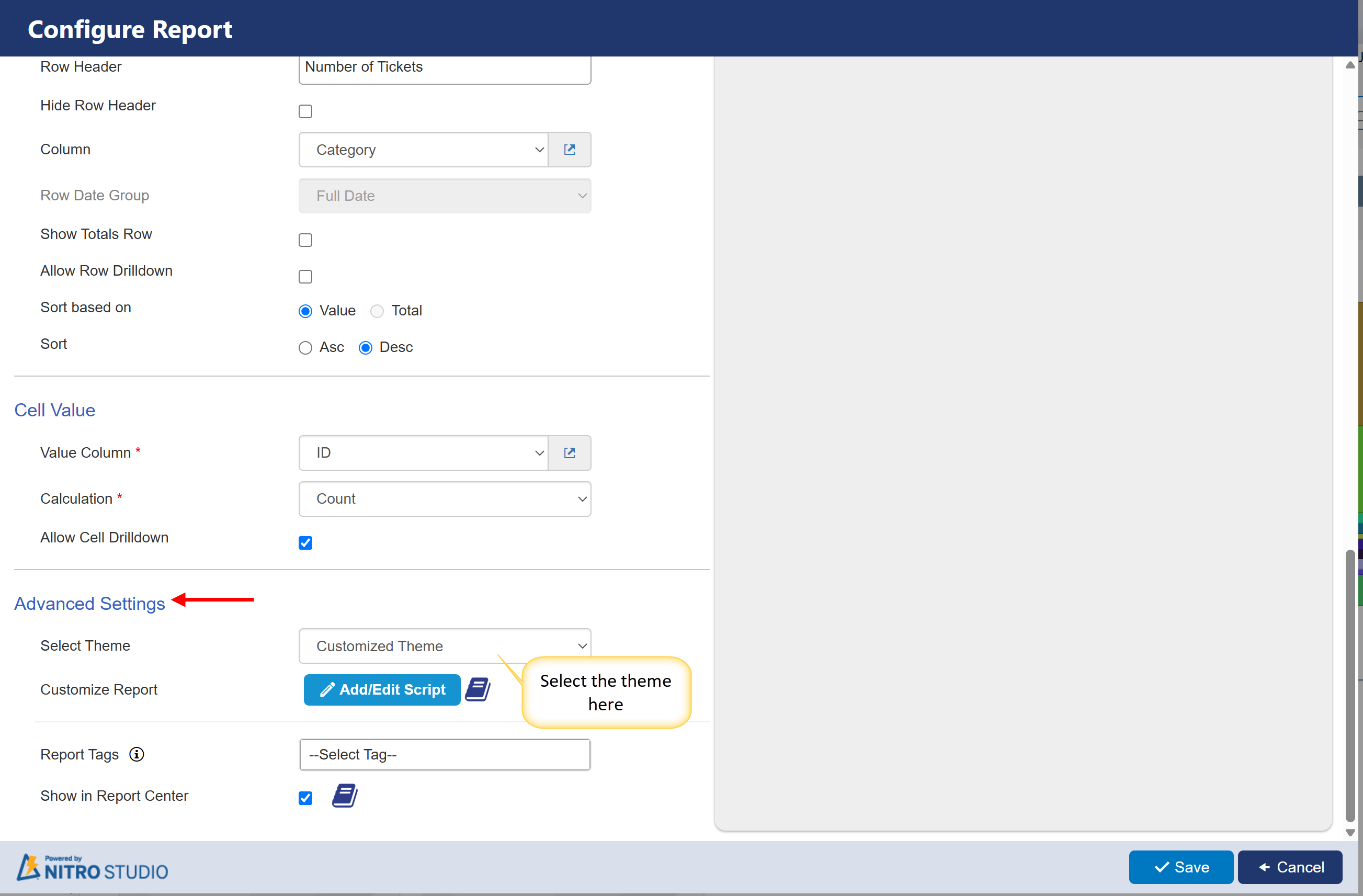
To apply a theme to a report, navigate to the Report Advanced section and select the desired theme, as shown below.
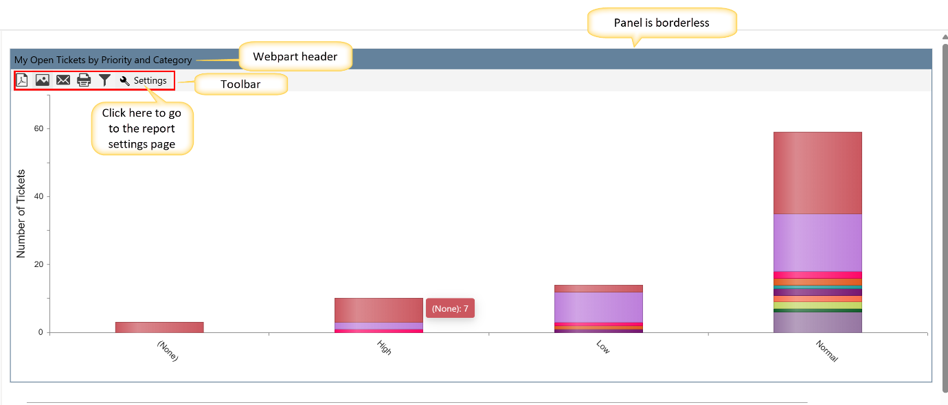
Sample output of General tab
General Tab with Panel and Webpart header settings
Output of General Tab after applying panel and Webpart header settings and hiding toolbar
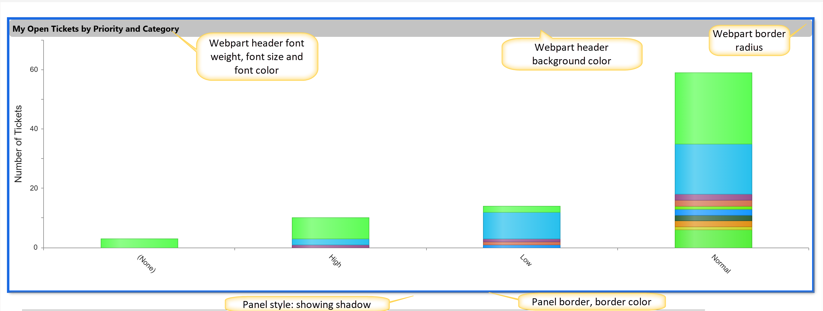
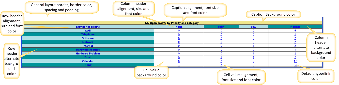
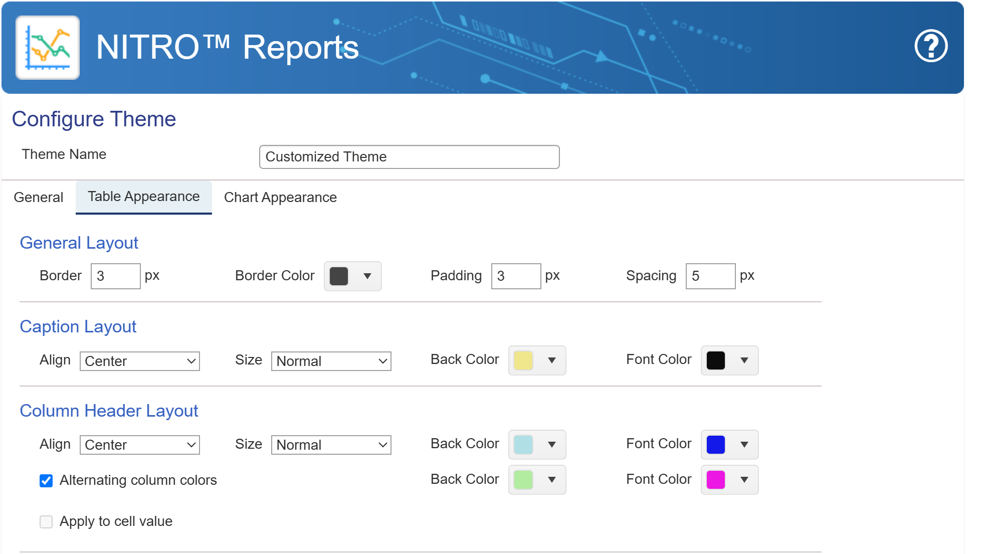
Table Appearance Setting for Reports
The Table Appearance tab allows users to configure the layout, colors, and formatting of tables in reports. Below is an explanation of the available settings:
Default settings:
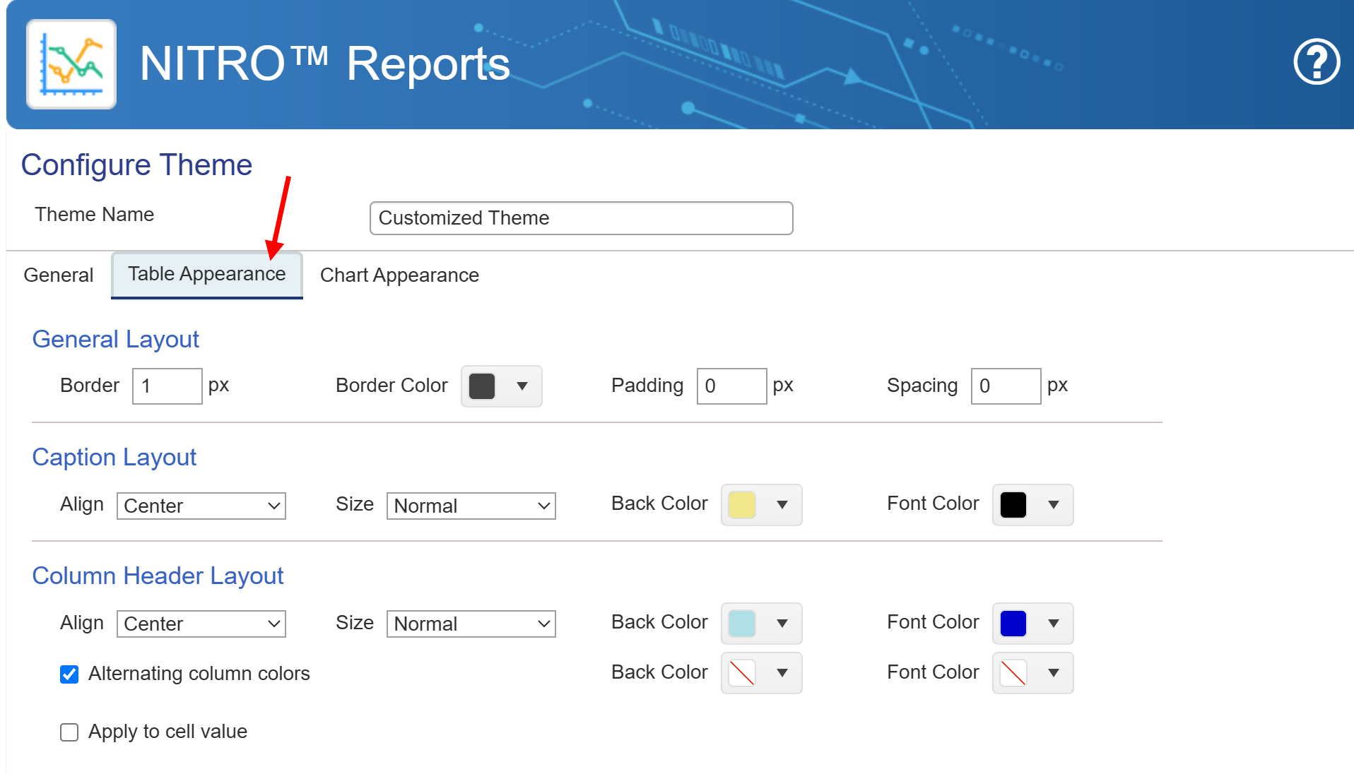
1. General Layout
•Border: Defines the thickness of the table's border in pixels.
•Border Color: Sets the color of the table's border.
•Padding: Specifies the space between the content and the cell border in pixels.
•Spacing: Defines the space between table cells in pixels.
2. Caption Layout
•Align: Determines the alignment (Left, Center, or Right) of the table caption.
•Size: Sets the font size of the caption (Normal, Large, etc.).
•Back Color: Changes the background color of the caption row.
•Font Color: Specifies the text color of the caption.
3. Column Header Layout
•Align: Defines the alignment (Left, Center, or Right) of column headers.
•Size: Adjusts the font size of the column headers.
•Back Color: Sets the background color of the column headers.
•Font Color: Changes the text color of the column headers.
Note: If column drilldown is enabled in the report configuration, the font color will not be applied. Instead, the hyperlink color will be used.
•Alternating Column Colors: When checked, it enables alternating background colors for column headers.
•Apply to Cell Value: If enabled, it applies the chosen formatting to the data values in the table.
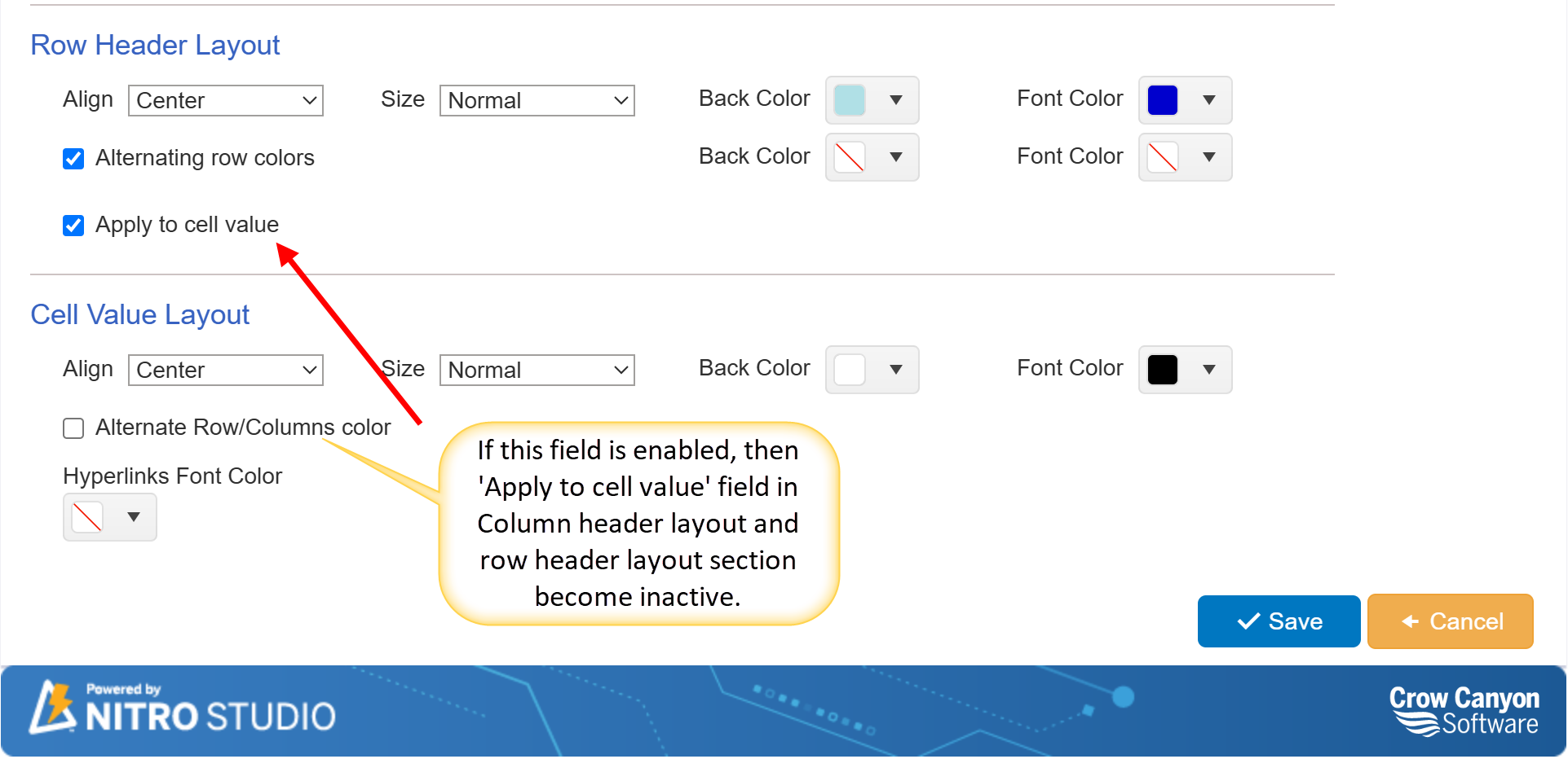
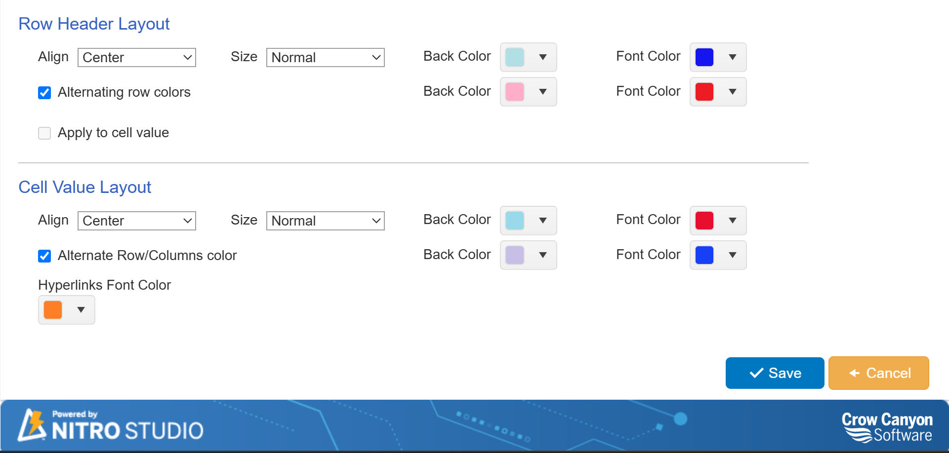
Row Header and Cell Value Layout Settings in NITRO Reports
The Row Header Layout and Cell Value Layout sections allow users to customize the appearance of table rows and cell values. Below is an explanation of each setting:
4. Row Header Layout
•Align: Sets the alignment of row headers (Left, Center, or Right).
•Size: Adjusts the font size of the row headers (Normal, Large, etc.).
•Back Color: Specifies the background color of row headers.
•Font Color: Defines the text color for row headers.
Note: If row drilldown is enabled in the report configuration, the font color will not be applied. Instead, the hyperlink color will be used.
•Alternating Row Colors: When checked, row headers will have alternating background colors for better readability.
•Apply to Cell Value: If enabled, this setting applies the row header formatting to the actual data cells.
5. Cell Value Layout
•Align: Specifies the text alignment for the data inside table cells (Left, Center, or Right).
•Size: Determines the font size of the data inside the table cells.
•Back Color: Sets the background color for data cells.
•Font Color: Defines the text color of the data inside the table.
Note: If cell value drilldown is enabled in the report configuration, the font color will not be applied. Instead, the hyperlink color will be used.
•Alternate Row/Column Colors: If enabled, this setting alternates the background colors for rows or columns, improving readability.
oNote: When this option is enabled, the "Apply to cell value" field in the Column Header Layout and Row Header Layout sections becomes inactive.
•Hyperlinks Font Color: Defines the font color for any hyperlinks present in the table.
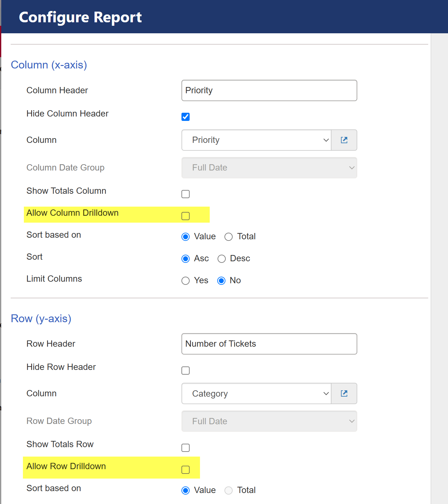
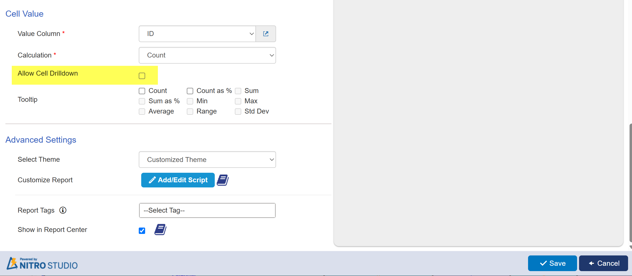
For hyperlinks, you need to enable column, row and cell value drilldown in report configuration. For this
Go to Report Configuration → Column (x-axis) section -> enable ‘Allow Column Drilldown’
Go to Row (y-axis) section -> enable ‘Allow Row Drilldown’
Go to Cell Value section -> enable ‘Allow Cell Drilldown’
These settings help in enhancing the visual clarity of reports by allowing users to format headers, rows, and values effectively.
User can change these settings according to their requirement.
Sample Output of Table
Customized settings of Table appearence:
Sample Output When Drilldown is Enabled in Report Configuration:
In this case, the hyperlink color is applied to the column header, row header, and cell values.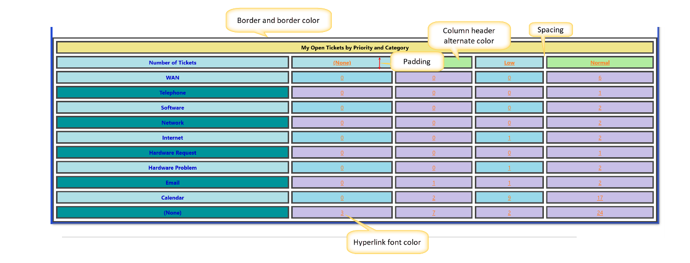
Sample Output When Drilldown is Not Enabled in Report Configuration:
In this case, the font color for the column header, row header, and cell values is applied as configured.
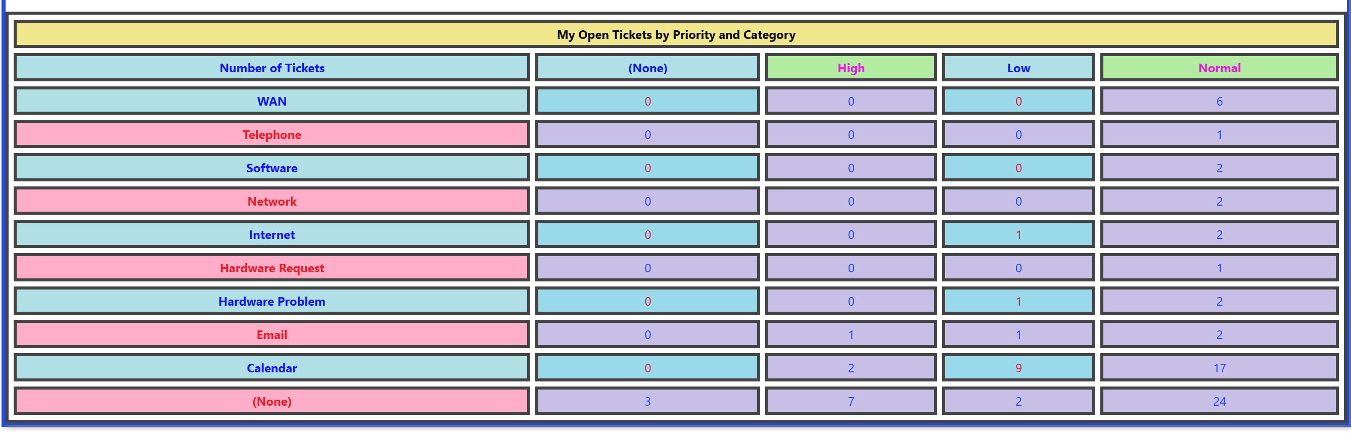
Chart Appearance for Reports:
Default settings:
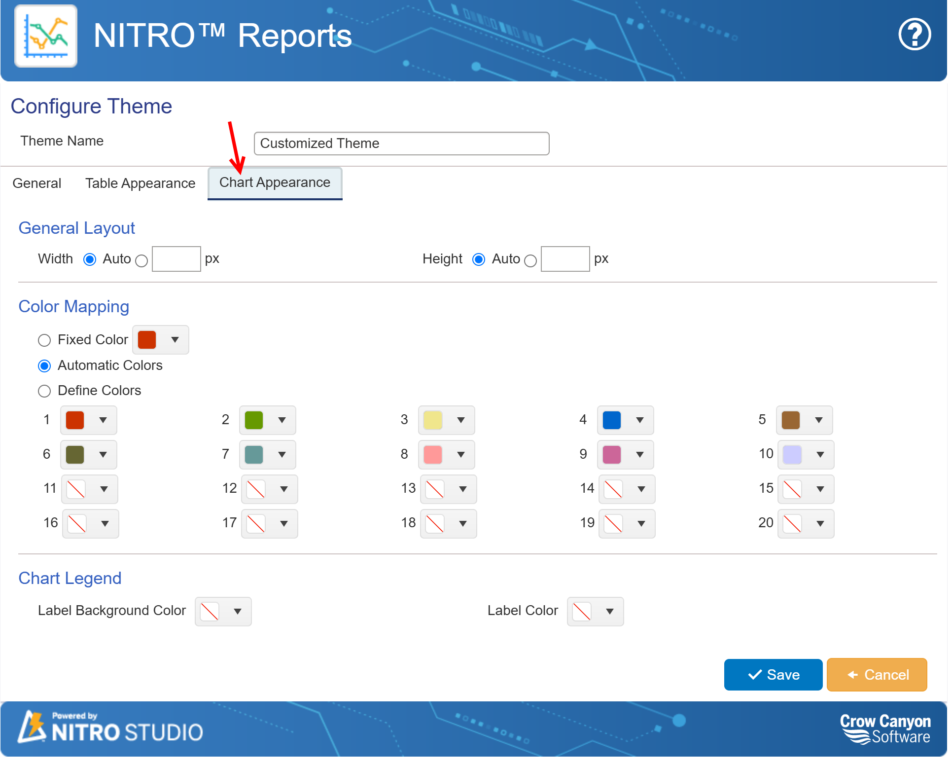
General Layout
These settings control the dimensions of the chart:
•Width: Can be set to "Auto" for dynamic scaling based on available space or manually defined using a fixed pixel width.
•Height: Similar to width, this can be set to "Auto" for automatic adjustment or specified with a custom pixel value for precise height control.
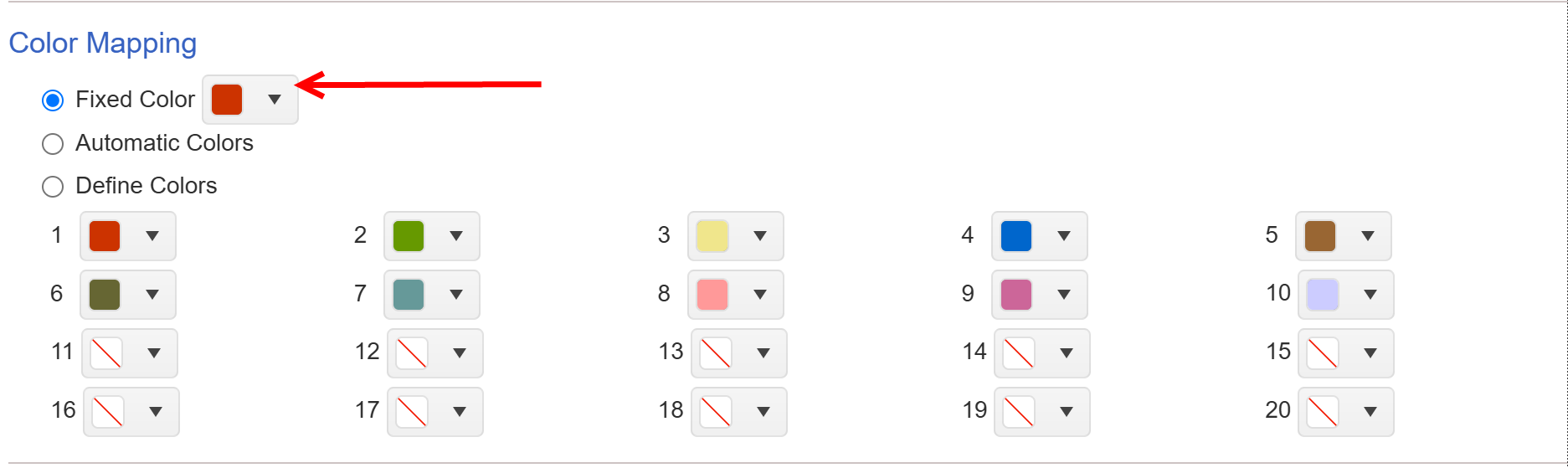
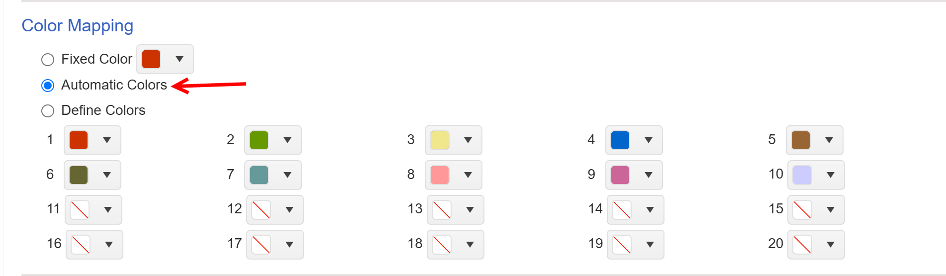
3. Color Mapping
The color mapping settings define how colors are applied to the chart elements:
•Fixed Color: Uses a single, consistent color across the entire chart.
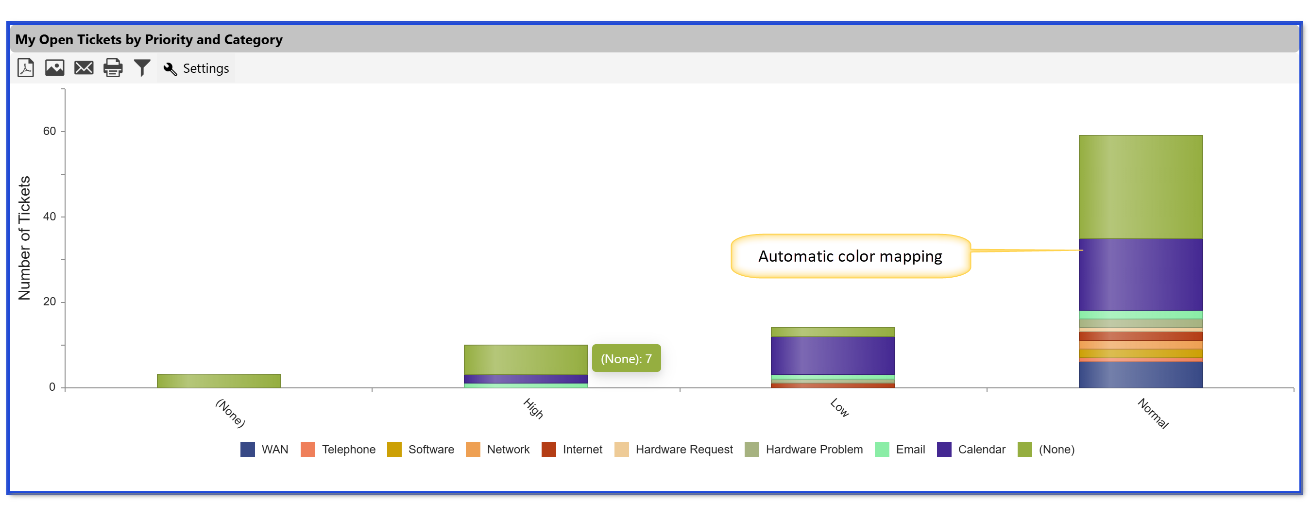
•Automatic Colors: Dynamically assigns different colors to various chart elements.
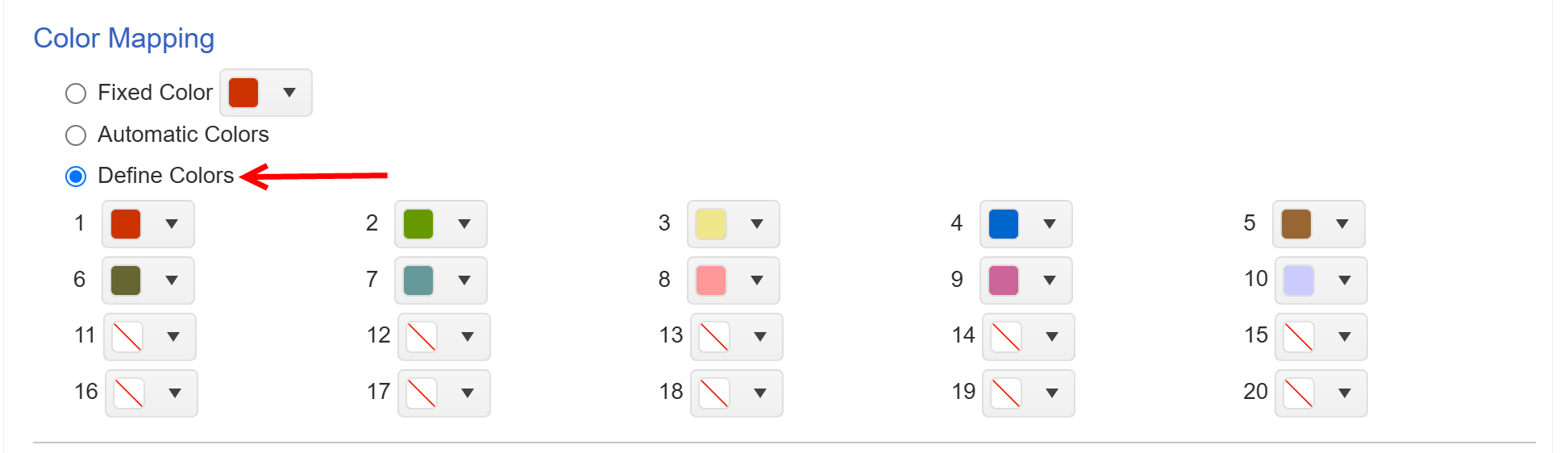
•Define Colors: Allows users to specify up to 20 custom color slots. Some slots come pre-filled, while others remain empty (represented by a "no color" symbol) for user input.
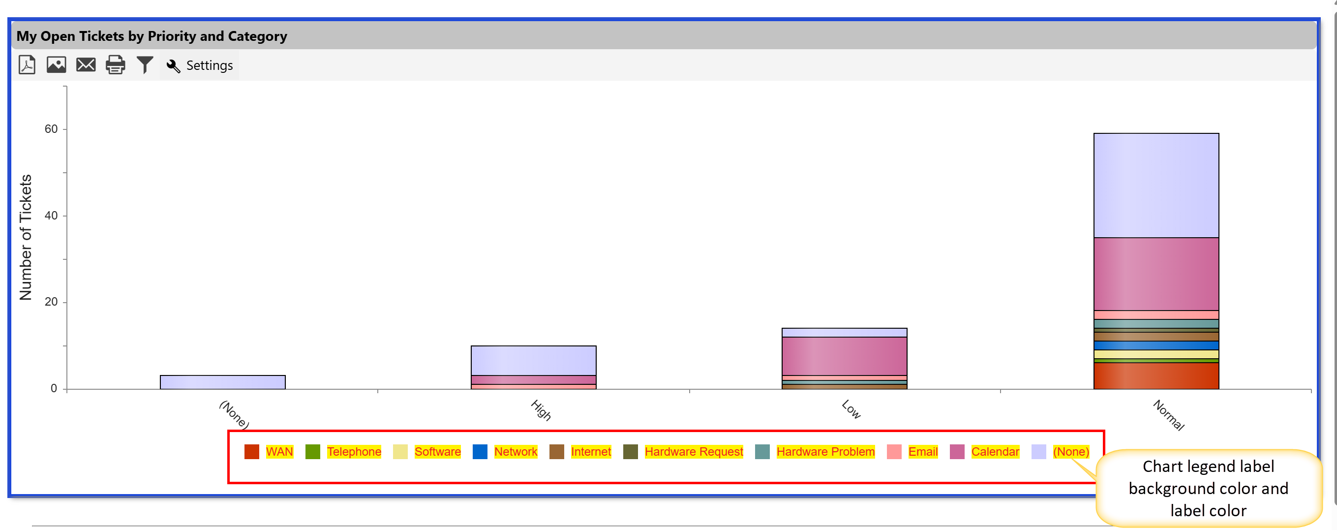
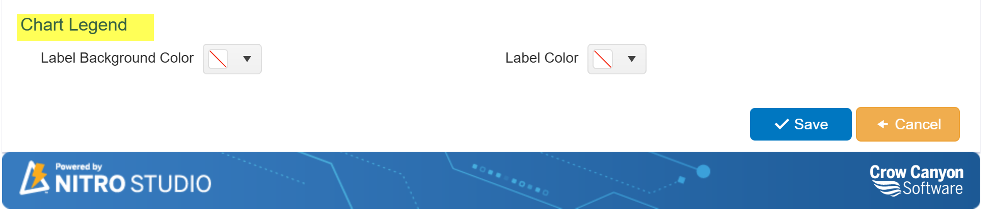
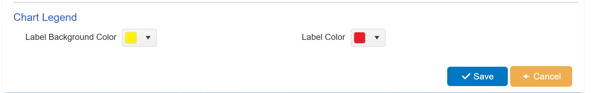
4. Chart Legend
These settings help improve the readability and appearance of the chart legend:
•Label Background Color: Defines the background color for legend labels to enhance contrast and visibility.
•Label Color: Allows users to select a suitable text color for the labels, ensuring clear and easy-to-read legends.
By configuring these settings, users can create visually appealing and well-structured charts that align with the overall theme of their reports. This customization enhances clarity, improves data presentation, and ensures consistency across multiple reports.
Below is the detail of each part of chart appearance
General Layout with ‘Auto’ width and height
General Layout with ‘custom’ width and height
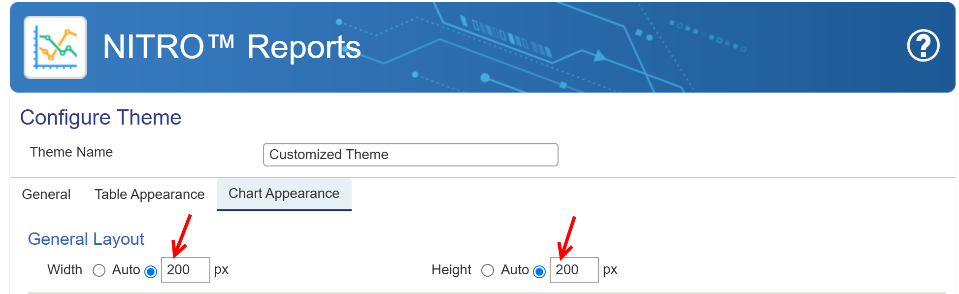
Sample output of customised width and height
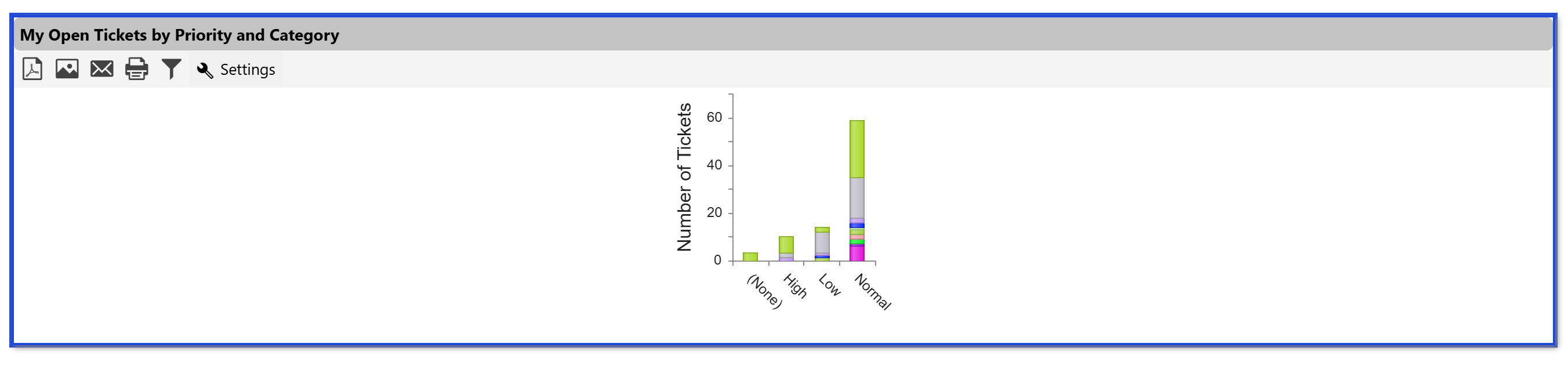
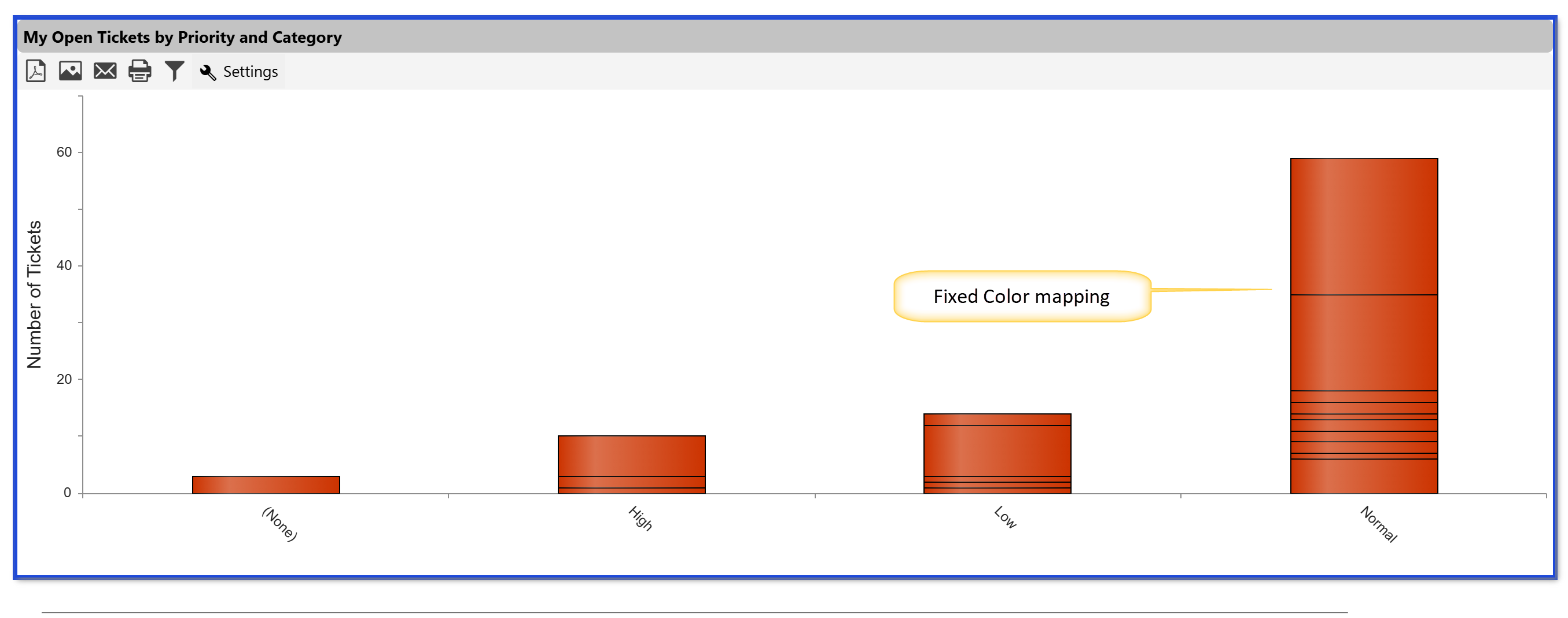
Fixed Color mapping in Chart Appearance
Sample Output of fixed colour mapping in chart appearance
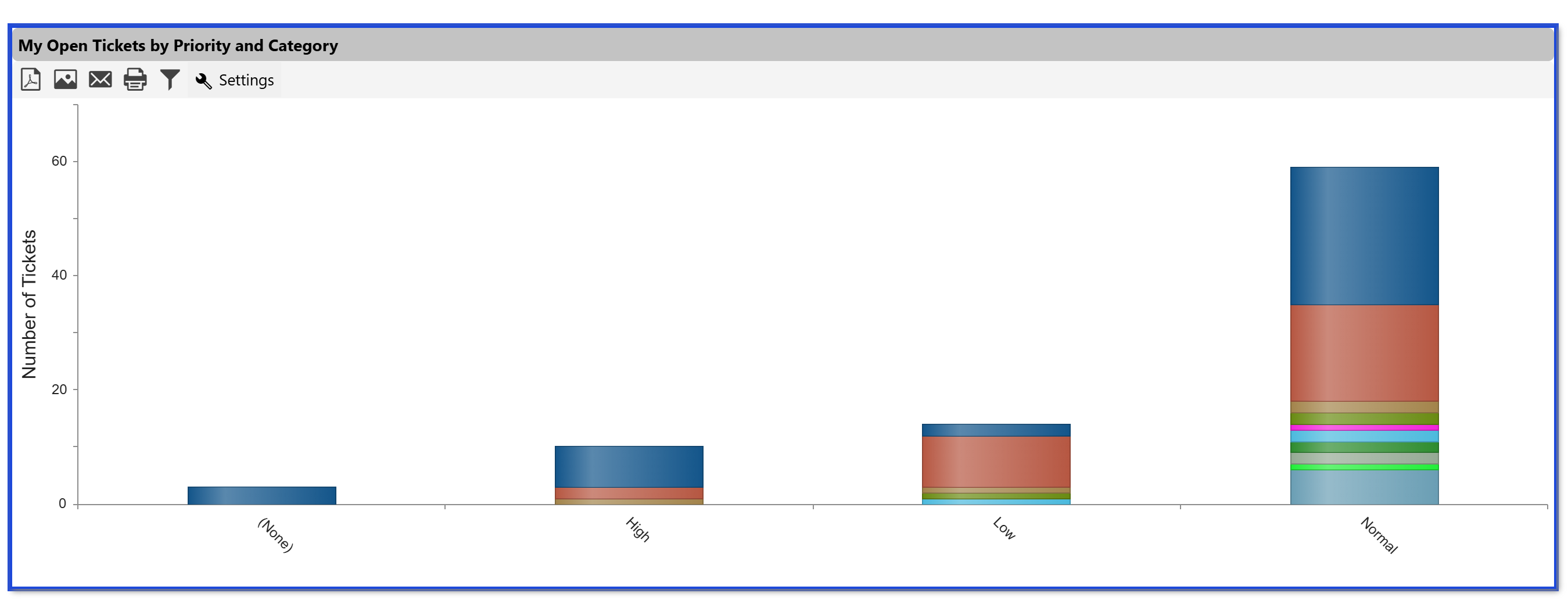
Automatic colors mapping in chart appearance
Sample output of automatic colors mapping in chart appearance
Define colors mapping in chart appearance
Sample output of define colours mapping in chart appearance
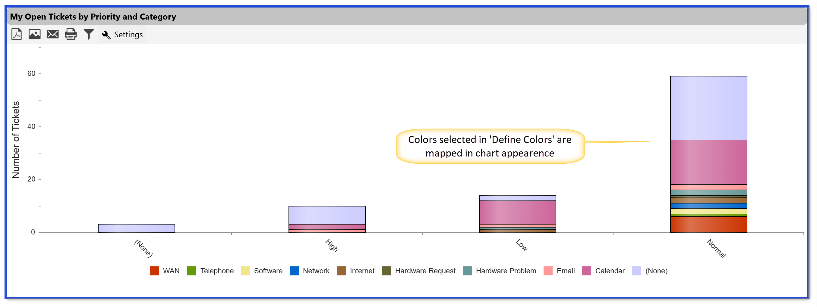
Chart Legend
Default settings:
To display the Chart Legend, go to Report Configuration → Report Type and select the option to show or hide the chart legend as needed. You can also specify the legend position and choose whether to render the chart in 2D.
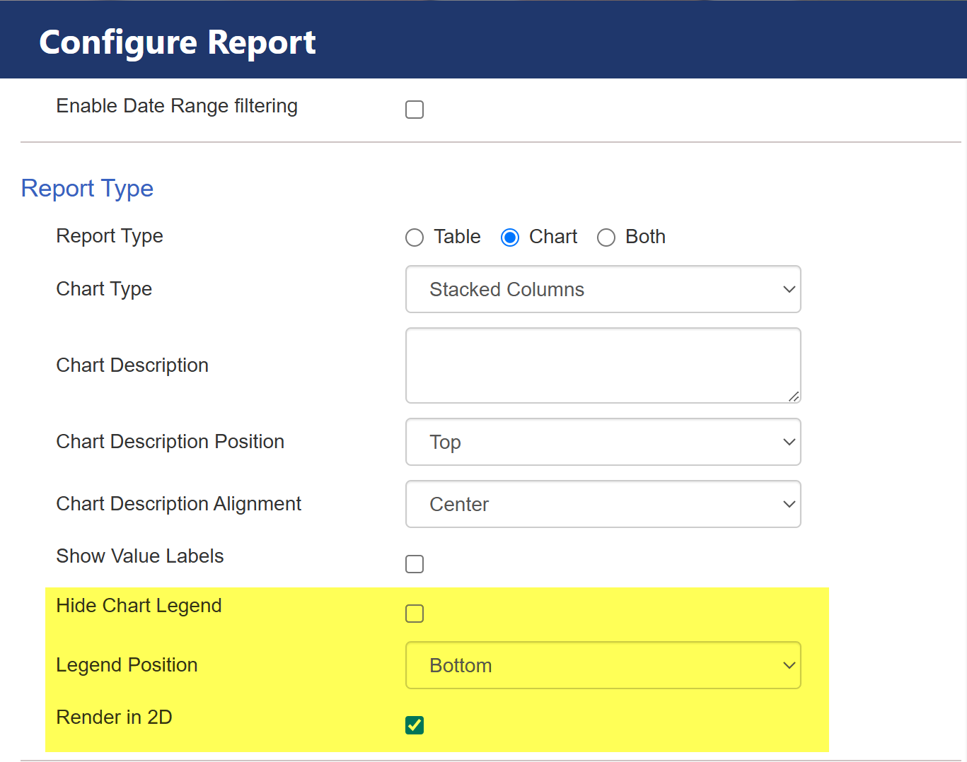
The highlighted settings in the Configure Report section control the appearance of the chart legend and rendering style:
1.Hide Chart Legend – If checked, the legend will be hidden from the chart. If left unchecked, the legend will be displayed.
2.Legend Position – This dropdown allows you to select the placement of the chart legend. In this case, it is set to Bottom, meaning the legend will appear below the chart.
3.Render in 2D – If checked, the chart will be displayed in a 2D format instead of a 3D representation.
These settings help customize the visual presentation of charts in the report.
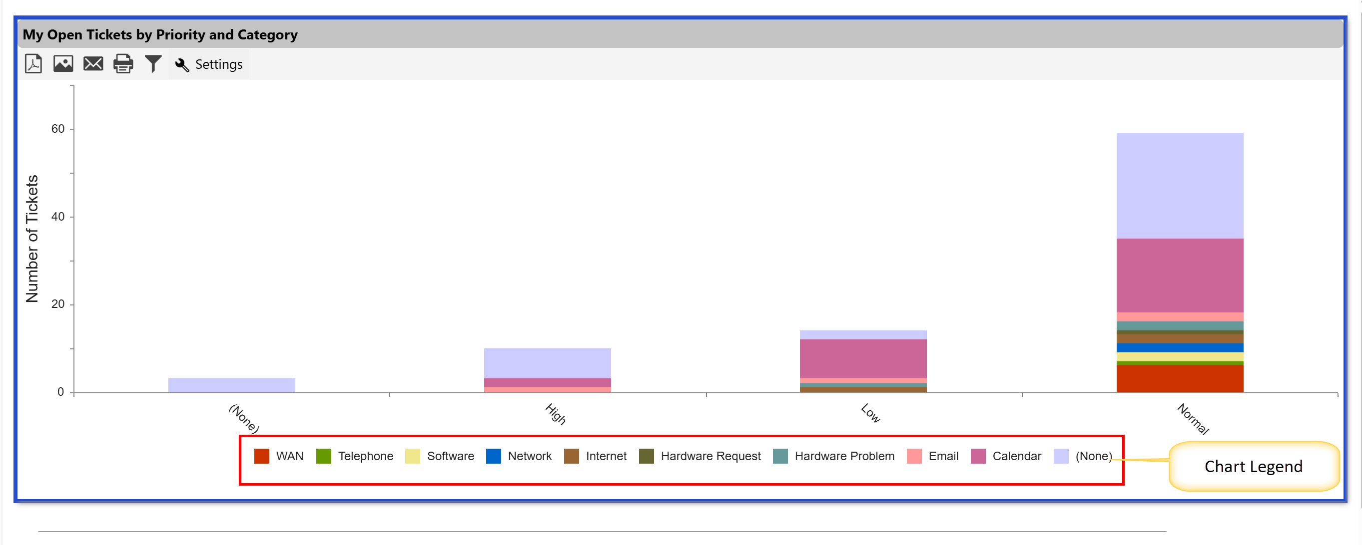
Sample output:
Customized Chart Legend settings:
Sample Output: